


-
Infestation
 Go to English text
 Lire l'article en Français English version
Publisher.
Infestation... How can we start the discussion? And you now what? I thought that this advert would catch me one hour to write the article. What a charming naivety...
Come on! Ladies, Gentlemen! Have a close look at the editor's name, at the bottom of the text... Yes! We will now tackle our first game from the Psygnosis company. Psygnosis. Repeat again after me. Psygnosis. Well, I know, it's always a bit sleazy to be overly enthusiastic when a touch of critical spirit and detachment can bring a healthy dialectic to the discussion.But saying this name is one of the main motivations of this blog is an understatement. This publisher is known and famous for the quality of its games and the extreme care given to the packaging, beginning of course by the illustrations. All assets are there to produce memorable adverts. Is it the case here? This is what we will try to discover together, even if the mystery is somewhat well-known.
Layout.
Compared to the previous works discussed here, something is as plain as the nose on your face: each piece of data is distributed in well separated and cut areas, different from each other, generating a very clear set.
The features include: black background, each frame surrounded by a thin red line with a significant space between them, one frame for the illustration, one for the narrative text, another to announce the company (name and address), one frame for the Psygnosis logo, and several others dispatched in columns to shoow in-game screenshots. Their postions are also fixed: illustration at the top left, the text below, logo and company at the bottom right, and screenshots at the top right.This layout, immutable, is in fact a trademark of this editor and we will prove it with the other games to come.
What is the purpose of such layout repetition, every time? Clarity of the story -already noted-, nothing to hide the picture, everything in its place without ambiguity, allowing readers to immediately know where to put the light to find what he seeks, and then the most important point: advert immediately associated with Psygnosis, whatever the game and the illustration are, the whole reinforced by the always identical and powerful logo.

Amiga (ingame) Transitivity.
Why is it so important to try to force such immediate identification? Because the publisher has built an enviable reputation of quality! Take the average score of their games and you will understand what I mean.
This oft-repeated quality allows to get the following association, in the readers' mind:
Advert of game X -> specific layout -> Psygnosis game -> quality game
which is unconsciously translated, game after game, into:
Advert of game X -> Psygnosis game -> quality game
then:
Advert of game X -> quality gameSummary:
if advert of game X uses the specific layout,
and this specific layout is the Psygnosis one,
and Psygnosis has a reputation of quality,
then advert of game X means a quality game.The result is the strong need to maintain the two pillars of this unconscious transitivity:
recognizable layout
and reputation of quality.
What a lovely principle of unconscious and devilishly effective transitivity, to be used by a marketing department.
But wait... Can we blame Psygnosis to use again and again such trick? Not at all! And precisely because this quick association is completely justified for many of their games, even if some exceptions have existed in the past. Anyway this message could not work if the basic concept -quality- is not a reality.
Amiga (intro) Graphical impact.
Finally, remember that the founders of Psygnosis have always advocated a simple belief: the graphical quality first!
Such a belief forces you to promote this need of a special visual message, screenshots and immutable logo, all embedded into each advert, adverts themselves inserted into as much as possible video games magazines.
A positive consequence is that the screenshots are always displayed, representative of the game itself and beautiful.
Beautiful and honest. A welcome -and too rare- feeling of a win-win relationship between buyers and a publisher.
Another consequence is the need of an external team of experienced and regular illustrators, hired to magnify many productions. Tim White, Infestation's illustrator, is one of them.
You still doubt about this will? What a pity to see someone with a so little faith! Read again one of the first leitmotiv concluding Psygnosis adverts:
"Seeing is believing"
Everything is summed up by these three words.Origin.
Where were we? Ah yes! Infestation...
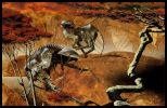
Let us concentrate on the illustration itself.
This is a work originally done for the cover of a book from Terry Pratchett, "Dark Side of The Sun" (The New English Library paperback editions). To know this origin is not only useful for showing off in society -note that if such information allows you to show off, do not avoid this small pleasure as it should be rare- but also because it may explain why this drawing presents an insect-robot. As a matter of fact, the first edition of this book, using another illustration, is a sort of robot-bee on a flower, worthy forerunner for our insect.
Book cover (1st edition) 
Book cover Subsequent editions do no more use it, to ensure a consistency with the "official" illustrator of Pratchett's books linked with the Discworld.
Promise.
So, we are here with a realistic Science-Fiction's illustration, with a huge number of details in the foreground, obscuring a totally blurred background and an effect of optical zoom, perhaps caused by some raindrops hanging on to the vegetation.
This vegetation, represented by the leaf, could calm us down, if it was possible to forget the robotic look and the palette of cold colors (blue, green), two items creating a nearly frightening atmosphere.
The insect is well centered and gives a perfect place for the title. A title full of promise.
Oh! But, wait... Are we another time talking about Roger Deanoff (see the article on Chris Achilleos)? Sure! He is also credited here for this lettering. No comment... What? No comment? Sure we will comment! Let's comment! How can we not see the palette of colors, colors completly different from the one used with the illustration, from orange to dark red, and the top of the letters, ending as a bloody wound. Another promise. We had perhaps started with something soothing, to go through a frightening feeling, but it will ends with a promise of danger, violence, horror! The transition could be insidious. The atmosphere is in place.

Amiga (title)
The semantics of the title is not the last to mean something. From the Latin Infestatio, devastation, the dictionary says "the action to infest", ie "ravaged by swarms, by hostile races". That's will take some doing!
The frame describing the game indicates the need to "go to Alpha, to study the planet and to stop at all costs the threat of the Aliens". "Do not play this game alone... this could be the last one!"
All the content of this explanatory frame from the advert therefore confirms these feelings, but seems almost unnecessary in front of the tremendous evocative power of the title, of the illustration from Tim White and the lettering of Roger Dean. An undeniable success.
In conclusion, let's admire the game box, front and back, very similar to the advert. Everything is there. It would have been a shame not to enjoy the work. A real pleasure!

Game box cover (front)

Game box cover (back) Game: Infestation.
Illustration: Tim Whiteoff ("Dark side of the sun").
Lettering: Roger Deanoff.
Publisher: Psygnosis.
Platforms: Atari ST, Amiga, DOS, Fm-Towns.
Date: 1990 (1994 for FM-Towns).
Links: [HOL] [Lemon]_______________________________
Related items: Version Française Editeur.
Infestation... Par où commencer? Et dire que je pensais que cette publicité allait me prendre une heure, pour rédiger l'article. Quelle naïveté touchante...
Voyons! Messieurs, mesdames! Regardez plus attentivement le nom de l'éditeur, en bas du texte... Et oui, nous allons maintenant aborder notre premier jeu de la société Psygnosis. Psygnosis. On répète encore une fois avec moi. Psygnosis. Oui, bon, je sais, c’est toujours un peu malsain d’être exagérément enthousiaste, quand un brin d’esprit critique et de détachement peut apporter une dialectique salutaire à la discussion.
Mais dire que ce nom est l'une des motivations principales de ce blog est un euphémisme. Cet éditeur est connu et reconnu pour la qualité de ses jeux et le soin extrême apporté au packaging, en passant bien évidemment par les illustrations. Tous les atouts sont donc réunis pour faire des publicités mémorables. Est-ce le cas ici? C'est ce que nous allons tenter de voir ensemble, même si le suspense est déjà quelque peu éventé.
Mise en page.
Par rapport aux précédents travaux abordés ici, un aspect saute immédiatement aux yeux: les différentes informations sont réparties dans des zones bien séparées, découpées, écartées les unes des autres, offrant ainsi un ensemble très clair.
Notons les caractéristiques: fond noir, chaque cadre entouré d'un fin trait rouge avec un espace significatif entre eux, un cadre pour l'illustration, un pour le texte explicatif, un autre pour annoncer la société (nom et adresse), un cadre pour le logo Psygnosis, et plusieurs en colonne pour les captures d'écran en jeu. Leurs positions sont aussi fixées: illustration en haut à gauche, le texte en dessous, logo et société en bas à droite, et captures d'écran en haut à droite.
Cette mise en page, immuable, est en fait une marque de fabrique de cet éditeur et nous le prouverons avec les autres jeux à venir.
Pourquoi répéter cette mise en page à chaque fois? Clarté de l'ensemble - déjà soulignée -, rien pour masquer l'illustration, chaque chose à sa place sans ambiguïté, ce qui permet aux lecteurs d'immédiatement savoir où porter le regard pour trouver ce qu'il cherche, et enfin le plus important: publicité immédiatement associée à Psygnosis, quelque soit le jeu et l'illustration, le tout renforcé par le logo toujours identique et percutant.
Amiga (ingame) Transitivité.
Pourquoi chercher cette identification immédiate? Parce que l’éditeur s'est forgé une réputation enviable de qualité! Faites la moyenne des notes obtenues pour leurs jeux et vous comprendrez ce dont je veux parler.
Cette qualité répétée permet d'obtenir l'association suivante, dans l'esprit des lecteurs:
publicité du jeu X -> mise en page spéciale -> jeu de Psygnosis -> jeu de qualité
ce qui se traduit de manière inconsciente, au fils des jeux, par:
publicité du jeu X -> jeu de Psygnosis -> jeu de qualité
puis:
publicité du jeu X -> jeu de qualité
En résumé:
si publicité du jeu X utilise la mise en page spéciale,
et que la mise en page spéciale est caractéristique de Psygnosis,
et que Psygnosis a une réputation de qualité,
alors publicité du jeu X = jeu de qualité.
D'ou la nécessité de maintenir les deux piliers de cette transitivité inconsciente:
la mise en page reconnaissable,
et la réputation de qualité.
C'est beau le principe de transitivité inconsciente et diablement efficace pour un service marketing.
Mais peut-on reprocher à Psygnosis d’abuser de ce stratagème? Oh que non! Justement parce que cette association rapide est totalement justifiée pour beaucoup de ses jeux, même si certains abus ont tout de même existé. De toute manière, ce message ne pourrait pas fonctionner si le concept fondamental, la qualité, était absent en réalité.
Amiga (intro) Graphique.
Enfin, sachez que les fondateurs de Psygnosis ont toujours défendu un credo simple: la qualité graphique avant tout!
Un tel credo ne peut qu'appuyer cette nécessité d'un message visuel identifiable, de captures d'écran et d'un logo immuable, le tout sur chaque publicité et une présence la plus abondante possible de celles-ci dans nombre de magazines de jeux vidéo de l'époque.
Une conséquence positive est que les captures d'écran sont toujours présentes, représentatives du jeu lui-même et splendides.
Beau et honnête. Un sentiment bienvenu, et trop rare, de relation gagnant-gagnant pour l'acheteur et l'éditeur.
Une autre conséquence est la nécessité d'une équipe d'illustrateurs externes réguliers et chevronnés, embauchés pour magnifier beaucoup de productions. Tim Whiteoff, illustrateur d'Infestation, en fait partie.
Vous doutez encore de cette volonté? Personnage de peu de foi! Relisez donc un des premiers slogans concluant les publicités de Psygnosis:
"Seeing is believing"
Tout est résumé par ces trois mots.
Origine.
Où en étions-nous? Ah oui! Infestation...
Concentrons-nous sur l'illustration en elle-même.
Il s'agit d'un travail réalisé originellement pour la couverture d'un livre de Terry Pratchett, "Dark Side of The Sun" (Les éditions New English Library paperback). Connaitre cette origine n'est pas seulement utile pour frimer en société - encore que si ce genre d'information vous permet de frimer, ne vous privez pas de ce petit plaisir, ca doit être rare - mais aussi parce qu'elle peut expliquer pourquoi ce dessin propose un insecte-robot. La première édition de ce livre, avec une autre illustration, présente en effet une sorte d'abeille-robot sur une fleur, digne précurseur de notre insecte.
Couverture de livre (1ère édition) Couverture de livre Les éditions ultérieures ne l'utilisent plus pour une question de cohérence avec l'illustrateur attitré des livres de Pratchett tournant autour du discworld.
Promesse.
Nous voilà donc avec une illustration de Science-fiction, réaliste, très détaillée pour l'avant-plan, masquant un arrière-plan totalement flou avec un effet de loupe optique, peut-être dû à des gouttes d'eau accrochées à la végétation.
Cette végétation, représentée par la feuille, pourrait être apaisante, si elle ne contrastait pas avec l'aspect robotisé et la palette de couleurs froides (bleu, vert), tendant plutôt vers l'angoissant.
L'insecte est très bien centré et offre une place parfaite pour le titre. Un titre plein de promesses.
Oh?! Mais, attendez... Nous revoilà à parler de Roger Deanoff (cf. l’article sur Chris Achilleos). Car c'est bien encore lui qui est crédité pour ce lettrage. Pas de commentaire... ou plutôt si! Commentons! Comment ne pas voir la palette de couleurs totalement différente de l'illustration, de l'orange vers le rouge sombre, et le haut des lettres se terminant comme une blessure sanglante. Encore une promesse. Mais si nous avions débuté par quelque chose d'apaisant, pour passer par l'angoissant, ca se termine en promesse de danger, violence, horreur! La transition pourrait être sournoise. Ca pose l'ambiance.
Amiga (titre) La sémantique du titre n'est pas non plus en reste. Du latin Infestatio, dévastation, le dictionnaire indique "l'action d'infester", c'est à dire "ravager par des irruptions, par des courses hostiles". Tout un programme.
Le cadre décrivant le jeu indique la nécessité de se "rendre sur Alpha, étudier cette planète et stopper coute que coute la menace des Aliens". "Mais ne jouez pas seul à ce jeu... cela pourrait être votre dernier!"
Tout le contenu de ce cadre explicatif sur la publicité confirme donc ces impressions mais parait presque superflu tant la puissance d'évocation du titre, du dessin de Tim White et du lettrage de Roger Dean est énorme. Une indéniable réussite.
Pour conclure, admirons la boite du jeu, avant et arrière, et les similarités flagrantes avec la publicité. Tout est là. Il aurait été dommage de ne pas profiter de tout ce travail. Un vrai bonheur!
Boite du jeu (avant)
Boite du jeu (arrière) Jeu: Infestation.
Illustration: Tim Whiteoff ("Dark side of the sun").
Lettrage: Roger Deanoff.
Editeur: Psygnosis.
Plateformes: Atari ST, Amiga, DOS, Fm-Towns.
Date: 1990 (1994 for FM-Towns).
Liens: [HOL] [Lemon]_______________________________
Articles associés: Tags : letter i, infestation, tim white, psygnosis, 1990, amiga, atari, dos, fm-towns, robot
-
Commentaires
Don't forget lessons from the past! N'oubliez pas les leçons du passé!
-
 Between the time when Pong was exciting, and the rise of the casual gaming, there was an age undreamed of.
And onto this, The 8/16 bits Era, destined to wear the jeweled crown of gaming upon a troubled brow.
It is I, his chronicler, who alone can tell the saga of RetroGame Art.
Let me tell you of the days of high adventure!
 Entre le temps où Pong était passionnant et l'avènement du casual gaming, il y avait un âge oublié.
Et dans cet âge trouble, L'Ere 8/16 bits, destinée à porter la couronne de joyaux du jeu.
C'est moi, son chroniqueur, qui seul peut vous parler de la saga de l'art dans le retrogaming.
Laissez-moi vous narrer ces jours d'aventures épiques!
-
Any comment are welcome. You can contact the author here: Tous les commentaires sont les bienvenus. Vous pouvez contacter l'auteur ici:
