


-
Obitus
 Go to English text
 Lire l'article en Français English version
We are still focused on the couple Tim Whiteoff (illustrator) / Psygnosis (publisher). As the previous feelings (KGS, Infestation) were very favorable, let's go on travelling with them.
Advert.
Here is finally an interesting variant of Psygnosis adverts. For the record, many of them share the same layout. In our case, this change is initiated by the dimensions of the image, here longer than high. This requires a new organization, while remaining within the spirit of the so-called "classic" version.
Such spirit is a set of common features, at last noteworthy thanks to this variant:- red frames,
- separated by a black background,
- a frame for the illustration,
- one for the logo,
- more for the screenshots,
- one for the text.
The differences are revealed through the following:
- organization of the frameset: drawing at the top, screenshots in the middle, text at the bottom,
- yellow insert in the text box to underline it,
- logo stuck to the screenshots,
- no more frame for the company address,
- twice the number of screenshots versus other adverts.

With a second alternative to the classical layout -also used for Obitus, by the way-, we can finally begin the prepration of the future study about the Psygnosis layouts, starting wigth a brief classification:- Classical
- Large drawing at the top
- 1/2 top-bottom
- 1/3 left-middle-right (not yet seen here)

Layout: classical

Layout: large drawing at the top

Layout: 1/2 top-bottom
Let's go back to Obitus and the screenshots now. Why such a high number of screenshots? Is it because Psygnosis saw a large graphical power in this game, more than in the previous one? As we know the high standards of the company, is it really possible to be surprised?
Let's exhume an excerpt from an article in the magazine Joystick (nb 7, July/August 1990, page 28):
"The best way to define Tempus is to say that it is a Super Dungeon Master"
My goodness! A successor to Dungeon Master (DM)? Better? Oohhh...
The text of the advert confirms the RPG direction and the screenshots sounds interesting.
This promise is even proved by the subsequent tests, but outperform DM is a giant step that we will take care to avoid.
Incidentally, have a look at the pre-publishing name of the game, Tempus, which will eventually become Obitus.
Tempus, the time, becomes Obitus, the death. Action becomes more important than the RPG side, direction confirmed by what you will have to do in-game.
Interlude.
Do not miss the last line of the text in the French version: the sentence is so much crazy that it is nearly incomprehensible and quite funny.
« Un RPG incitant avec plus d’une pincée de touche et mouche », which can be litterally translated in English by:
"A RPG encouraging with more than a pinch of touch and fly"
????
Let's have a look at the original version:
"Impelling RPG with more than a dash of hack'n'slash."
A big bravo for the automatic translator at the time, or the first year student in French that had never played a single hack'n'slash of his life.
It would have been a shame to deprive us of such "touch" of fun by hiring a professional.
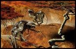
Illustration: it's great. (<=un-translatable pun as "nice" in French can be translated by the same word that also means owl)
It seems to be so simple! Just an owl (a horned owl?).
But to pay no heed of the appearance is not a luxury, as we saw earlier with the work of Tim on KGS.
The behaviour of our animal is powerful: in full stoop on on, full claw, open mouth, menacing teeth, bristly feathers, like a studded armor, ears shaped to a point, sharp eye... You'll have to feel the weight of the 20=dice and roll it to obtain a more than good result in defence if you hope to survive in this RPG!
The background brings a feeling of speed to increase the stoop.
The owl is a huge amount of graphical work: we see it clearly on the cover of the game itself.

It's not that great... (same un-translatable pun)
But wait a minute... What is the meal of the owls? Mice. hummm... Does Psygnosis think about ourselves as mice? Such image says a lot of things about what is going to happen if we play the game, what will be the troubles and our frailty in front of the announced challenges.
Once more the whole picture is both frightening and threatening. Just enough to give us the desire to known more about it.
...Wait another minute... a owl... Psygnosis... logo... the purple owl!
Impossible to believe that this owl has been chosen without an ulterior motive about the publisher and his official logo. So, this warlikeowl is also the personification of Psygnosis here? By Jove!


Psygnosis logo Psygnosis logo Obitus Owl
The nice and friendly publisher, with his nice logo, changes one's mind when the time comes to fight for his games and sell them to the poor little mice we are.
The main meaning of the illustration is fortunately not there, but the third level of reading is very interesting to more deeply understand the policy of the publisher. If there was a need to confirm it, that's done: we are not dealing with an amateurish company, whether we consider the quality of the games, the illustrations or the ambitions.

Title: Roger! Received 5 out of 5. Over.
We are near the end of the story and you think (if you've read the previous articles) that it will be nice to speak about the title. As you are also far from having a cerebral activity with a maximum level near our mouse's, you have also recognized a typical lettering from Roger Deanoff, the flagship illustrator from Psygnosis (please, note the insidious undermining more or less unobtrusively carried out from some of the last articles, to highlight the style and the importance of Mr Dean, in the context of video gaming during the 80-90 years).
Although the lettering of KGS is a bit far from the preferred style of Roger Dean, this one provides a perfect example about it:
extreme and ubiquitous curves, distorted letters, which are glued in these curves and dotted with hooks and tips, strongly marked circumference, doubled here, all using different colors (3: purple, black, red).
For this title, all the letters come together at the top, compressed, leaning over to achieve it.
And the top gives a strange feeling... Isn't it here the look of the owl, spying us? The top of the head, a clear line to emphasize the eyes that express themselves through the spaces located between the outgrowths of the letters, and a nose, a long nose, in the middle?
If we conclude with the two main hooks, which can be the threatening wings or the claws of the two hind legs, surrounding three smaller tips like the bristly feathers, there is no more any doubt. Mainly for those who have an interesting result to the classical Rorschach test, I know.
Feelings.
As we know that the first sponsor of this drawing is a book publisher, for the cover of "Under a Calculating Star" (note 1), all the aims analyzed here and attributed to the author about the game, become aim (and an excellent choice) of Psygnosis. The work is nevertheless still done by the artist.
Being able to ramble about this advert, without speaking of the game itself, underlines the power of the illustration and the talent of the team composed by Tim Whiteoff/Roger Deanoff, as well as the perfect layout from Psygnosis.
It's a good work, indeed: don't you want to play or even buy this game now, almost 20 years after its release? I do!


Obitus: in-game title Obitus: screenshot
Game: Obitus
Illustration: Tim Whiteoff.
Lettering: Roger Deanoff.
Publisher: Psygnosis.
Platforms: Amiga, Atari ST, SNES, PC.
Date: 1991.
Links: [HOL] [Lemon].
Note 1: exercpt from the official website of Tim White.
"They had made their way across the snow covered desert and past the vast graveyard of mangled spacecraft. Then they stood gazing at the huge mighty Citadel on this distant world. What dangers awaited them in the perilous labyrinth behind the towering walls they could not imagine... From the book 'Under a Calculating Star' by John Morressy. Publisher: New English Library UK."
_______________________________
Related items:- Tim White: Amnios
- Tim White: Infestation
- Tim White: Leander
- Tim White: The Killing Game Show
- Tim White
Version Française
Nous revoilà concentré sur le couple Tim Whiteoff (illustrateur) / Psygnosis (éditeur). Les précédentes impressions (KGS, Infestation) étant très favorables, continuons le voyage en leur compagnie.
Publicité.
Voilà enfin une variante intéressante des publicités Psygnosis. Pour mémoire, beaucoup d’entre elles partagent la même mise en page. Dans notre cas, cette modification est initiée par les proportions de l’image, ici plus longue que haute. Ceci oblige à une nouvelle organisation, tout en restant dans l’esprit de la version dite « classique ».
Cet esprit se compose de caractéristiques communes, enfin remarquables grâce à cette variante:- des cadres rouges,
- séparés par un fond noir,
- un cadre pour le dessin,
- un pour le logo,
- plusieurs pour les captures d’écran,
- un pour le texte.
Les différences se dévoilent à travers ce qui suit :
- organisation des cadres les uns par rapport aux autres : dessin en haut, captures d’écran au milieu, texte en bas,
- encart jaune dans la zone de texte pour une mise en exergue spécifique,
- logo collé aux captures,
- cadre supprimé pour l’adresse de la compagnie,
- deux fois plus de captures que les autres publicités.
En ajoutant une deuxième alternative à la proposition classique - elle aussi utilisée pour Obitus -, nous pouvons enfin débuter la préparation de l’étude future des mises en page de Psygnosis, en commençant par une succincte classification :- Classique
- Dessin large en haut
- ½ haut-bas
- 1/3 gauche-milieu-droite (à venir)
Mise en page: classique
Mise en page: dessin large en haut
Mise en page: 1/2 haut-bas
Revenons à Obitus et aux captures d’écran pour l’instant, multipliées pour l’occasion.
Pourquoi autant de captures ? Est-ce que Psygnosis voyait ce jeu avec un énorme potentiel graphique, plus prononcé que leurs autres productions ?
Etant donné l’exigence de cette société sur ce sujet, faut-il s’attendre à en rester coi ?
Exhumons un extrait d’un article du magazine Joystick (7, juillet/aout 1990, page 28):
« la meilleure façon de définir Tempus, c’est de dire que c’est un Super Dungeon Master »
Mazette ! Un successeur de Dungeon Master (DM) ? En mieux ? Ouch…
Le texte de la publicité confirme l’orientation RPG et les captures promettent beaucoup.
Cette promesse est même avérée par les tests ultérieurs mais de la à surclasser DM, il y a un pas de géant que nous nous garderons bien de franchir !
Notez au passage le nom de prépublication du jeu, Tempus, qui deviendra finalement Obitus.
Tempus, le temps, devient Obitus, la mort. Le coté action devient prédominant sur l’aspect RPG, orientation confirmée par ce que vous aurez à faire en jeu.
Intermède.
Ne passez pas à coté de la dernière ligne du texte de la version française : incompréhensible et assez drôle, tellement la phrase est loufoque.
« Un RPG incitant avec plus d’une pincée de touche et mouche »
????
Voyons sans attendre l’original :
« Impelling RPG with more than a dash of hack’n’slash ».
Ce qui nous donne dans la langue de Molière :
« Un RPG captivant avec une pointe prononcée de hack’n’slash ».
Un grand bravo pour le traducteur automatique de l’époque, ou l’étudiant de première année en langue qui n’avait jamais joué à un seul hack’n’slash de sa vie.
Il eut été bien dommage de nous priver de cette touche amusante en employant un professionnel.
Illustration : c’est chouette.
Que de simplicité en apparence ! Une chouette (un hibou ?).
Mais passer outre les apparences n’est pas un luxe, comme nous l’avons vu précédemment avec le travail de Tim sur KGS.
L’attitude de notre animal est percutante : en plein piqué sur nous, griffes en avant, gueule ouverte, dentition menaçante, plumes hérissées, ressemblant à une armure cloutée, oreilles en pointe, regard perçant… Il va falloir soupeser ses dés 20 et sortir un jet en défense plus que correct si on veut espérer survivre dans ce RPG !
Le fond amène une impression de rapidité pour renforcer le piqué.
La chouette est graphiquement et globalement très travaillée : on le voit clairement sur la jaquette du jeu lui-même.
C’est pas si chouette…
Mais au fait, de quoi se nourrissent les chouettes ? De souris. Eh oui…
Psygnosis nous considère-t-il donc comme des souris ? Cette image en dit long sur ce qui va se passer si on se plonge dans ce jeu, les difficultés à venir et notre fragilité face aux défis annoncés.
Encore une fois, le tout est à la fois angoissant et menaçant. Juste ce qu’il faut pour nous donner envie d’en savoir plus.
Mais attendez… une chouette… Psygnosis… logo… purple owl !
Impossible que cette chouette ait été choisie sans une arrière pensée pour l’éditeur et son logo officiel. Cette chouette belliqueuse représenterait aussi la compagnie Psygnosis ? Diantre !
Logo Psygnosis Logo Psygnosis Chouette Obitus
L’éditeur sympathique, avec son logo sympathique, gentil, change d’attitude lorsqu’il s’agit de défendre ses jeux et de les vendre, aux pauvres petites souris que nous sommes.
Le sens premier de l’illustration n’est heureusement pas là, mais ce troisième niveau de lecture est des plus intéressant pour comprendre plus en profondeur la politique de l’éditeur. S’il y avait besoin de le confirmer, c’est fait : nous n’avons pas affaire à des amateurs, que ce soit pour la qualité des jeux, des illustrations ou des ambitions.
Titre : Roger ! Reçu 5 sur 5. Terminé.
Nous arrivons à la fin et vous vous dites (si vous avez lu les articles précédents) qu’il serait bien urbain de causer du titre. Comme vous êtes loin d’avoir une activité cérébrale plafonnant au niveau de celle de notre souris, vous avez aussi reconnu un lettrage typique de Roger Deanoff, l’illustrateur phare de Psygnosis (notez le travail de sape mené plus ou moins discrètement depuis quelques articles pour vous faire prendre conscience du style et de l’importance de Mr Dean dans le microcosme vidéoludique des années 80-90).
Autant le lettrage de KGS nous éloigne un peu du style préféré de Roger, autant celui-ci en offre une parfaite illustration : des rondeurs outrancières, omniprésentes, des lettres déformées, engluées dans ces courbes, parsemées de crochets et de piques, un détourage prononcé, doublé ici, le tout en plusieurs couleurs (3 : violet, noir, rouge).
Pour ce titre, toutes les lettres se rassemblent au sommet en se compressant, se penchant pour y parvenir.
Et le sommet donne une étrange sensation… N’avons-nous pas là un regard de chouette qui nous épie ? Le sommet de la tête, une démarcation pour souligner les yeux qui s’expriment a travers les espaces laissés entre les excroissances des lettres, et un nez, long, au milieu ?
Si on termine en assimilant les deux crochets principaux aux ailes menaçantes ou même aux griffes des deux pattes arrière, encadrant trois piques plus petites pour les plumes hérissées, le doute n’est plus de mise. Enfin pour ceux qui ont un bilan intéressant au classique test de Rorschach.
Impression.
Quand on sait que le premier commanditaire de ce dessin est un éditeur de livres, pour la couverture de "Under a Calculating Star" (note 1), toutes les intentions prêtées à l'auteur par rapport au jeu et décortiquées ici se transforment en intention (et en excellent choix) de Psygnosis. Le travail n'en reste pas moins celui de l'artiste.
Divaguer autour de cette publicité, sans même aborder le jeu, souligne la puissance de cette illustration, le talent du tandem Tim Whiteoff/Roger Deanoff, et la mise en page parfaite de Psygnosis.
Du beau travail : n’avez-vous pas envie d’y jouer, voir d’acheter ce jeu, presque 20 ans après sa sortie? Moi, si ! Qui l’eut cru ?
Obitus: titre en jeu Obitus: capture en jeu
Jeu: Obitus
Illustration: Tim Whiteoff.
Lettrage: Roger Deanoff.
Editeur: Psygnosis.
Plateformes: Amiga, Atari ST, SNES, PC.
Date: 1991.
Liens: [HOL] [Lemon].
Note 1: extrait du site officiel de Tim White.
"They had made their way across the snow covered desert and past the vast graveyard of mangled spacecraft. Then they stood gazing at the huge mighty Citadel on this distant world. What dangers awaited them in the perilous labyrinth behind the towering walls they could not imagine... From the book 'Under a Calculating Star' by John Morressy. Publisher: New English Library UK."
_______________________________
Articles associés: Tags : letter o, obitus, tim white, psygnosis, 1991, amiga, atari, snes, dos
-
Commentaires
Don't forget lessons from the past! N'oubliez pas les leçons du passé!
-
 Between the time when Pong was exciting, and the rise of the casual gaming, there was an age undreamed of.
And onto this, The 8/16 bits Era, destined to wear the jeweled crown of gaming upon a troubled brow.
It is I, his chronicler, who alone can tell the saga of RetroGame Art.
Let me tell you of the days of high adventure!
 Entre le temps où Pong était passionnant et l'avènement du casual gaming, il y avait un âge oublié.
Et dans cet âge trouble, L'Ere 8/16 bits, destinée à porter la couronne de joyaux du jeu.
C'est moi, son chroniqueur, qui seul peut vous parler de la saga de l'art dans le retrogaming.
Laissez-moi vous narrer ces jours d'aventures épiques!
-
Any comment are welcome. You can contact the author here: Tous les commentaires sont les bienvenus. Vous pouvez contacter l'auteur ici:


