


-
 Go to English text
 Lire l'article en Français English version
We are still focused on the couple Tim Whiteoff (illustrator) / Psygnosis (publisher). As the previous feelings (KGS, Infestation) were very favorable, let's go on travelling with them.
Advert.
Here is finally an interesting variant of Psygnosis adverts. For the record, many of them share the same layout. In our case, this change is initiated by the dimensions of the image, here longer than high. This requires a new organization, while remaining within the spirit of the so-called "classic" version.
Such spirit is a set of common features, at last noteworthy thanks to this variant:- red frames,
- separated by a black background,
- a frame for the illustration,
- one for the logo,
- more for the screenshots,
- one for the text.
The differences are revealed through the following:
- organization of the frameset: drawing at the top, screenshots in the middle, text at the bottom,
- yellow insert in the text box to underline it,
- logo stuck to the screenshots,
- no more frame for the company address,
- twice the number of screenshots versus other adverts.

With a second alternative to the classical layout -also used for Obitus, by the way-, we can finally begin the prepration of the future study about the Psygnosis layouts, starting wigth a brief classification:- Classical
- Large drawing at the top
- 1/2 top-bottom
- 1/3 left-middle-right (not yet seen here)

Layout: classical

Layout: large drawing at the top

Layout: 1/2 top-bottom
Let's go back to Obitus and the screenshots now. Why such a high number of screenshots? Is it because Psygnosis saw a large graphical power in this game, more than in the previous one? As we know the high standards of the company, is it really possible to be surprised?
Let's exhume an excerpt from an article in the magazine Joystick (nb 7, July/August 1990, page 28):
"The best way to define Tempus is to say that it is a Super Dungeon Master"
My goodness! A successor to Dungeon Master (DM)? Better? Oohhh...
The text of the advert confirms the RPG direction and the screenshots sounds interesting.
This promise is even proved by the subsequent tests, but outperform DM is a giant step that we will take care to avoid.
Incidentally, have a look at the pre-publishing name of the game, Tempus, which will eventually become Obitus.
Tempus, the time, becomes Obitus, the death. Action becomes more important than the RPG side, direction confirmed by what you will have to do in-game.
Interlude.
Do not miss the last line of the text in the French version: the sentence is so much crazy that it is nearly incomprehensible and quite funny.
« Un RPG incitant avec plus d’une pincée de touche et mouche », which can be litterally translated in English by:
"A RPG encouraging with more than a pinch of touch and fly"
????
Let's have a look at the original version:
"Impelling RPG with more than a dash of hack'n'slash."
A big bravo for the automatic translator at the time, or the first year student in French that had never played a single hack'n'slash of his life.
It would have been a shame to deprive us of such "touch" of fun by hiring a professional.
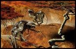
Illustration: it's great. (<=un-translatable pun as "nice" in French can be translated by the same word that also means owl)
It seems to be so simple! Just an owl (a horned owl?).
But to pay no heed of the appearance is not a luxury, as we saw earlier with the work of Tim on KGS.
The behaviour of our animal is powerful: in full stoop on on, full claw, open mouth, menacing teeth, bristly feathers, like a studded armor, ears shaped to a point, sharp eye... You'll have to feel the weight of the 20=dice and roll it to obtain a more than good result in defence if you hope to survive in this RPG!
The background brings a feeling of speed to increase the stoop.
The owl is a huge amount of graphical work: we see it clearly on the cover of the game itself.

It's not that great... (same un-translatable pun)
But wait a minute... What is the meal of the owls? Mice. hummm... Does Psygnosis think about ourselves as mice? Such image says a lot of things about what is going to happen if we play the game, what will be the troubles and our frailty in front of the announced challenges.
Once more the whole picture is both frightening and threatening. Just enough to give us the desire to known more about it.
...Wait another minute... a owl... Psygnosis... logo... the purple owl!
Impossible to believe that this owl has been chosen without an ulterior motive about the publisher and his official logo. So, this warlikeowl is also the personification of Psygnosis here? By Jove!


Psygnosis logo Psygnosis logo Obitus Owl
The nice and friendly publisher, with his nice logo, changes one's mind when the time comes to fight for his games and sell them to the poor little mice we are.
The main meaning of the illustration is fortunately not there, but the third level of reading is very interesting to more deeply understand the policy of the publisher. If there was a need to confirm it, that's done: we are not dealing with an amateurish company, whether we consider the quality of the games, the illustrations or the ambitions.

Title: Roger! Received 5 out of 5. Over.
We are near the end of the story and you think (if you've read the previous articles) that it will be nice to speak about the title. As you are also far from having a cerebral activity with a maximum level near our mouse's, you have also recognized a typical lettering from Roger Deanoff, the flagship illustrator from Psygnosis (please, note the insidious undermining more or less unobtrusively carried out from some of the last articles, to highlight the style and the importance of Mr Dean, in the context of video gaming during the 80-90 years).
Although the lettering of KGS is a bit far from the preferred style of Roger Dean, this one provides a perfect example about it:
extreme and ubiquitous curves, distorted letters, which are glued in these curves and dotted with hooks and tips, strongly marked circumference, doubled here, all using different colors (3: purple, black, red).
For this title, all the letters come together at the top, compressed, leaning over to achieve it.
And the top gives a strange feeling... Isn't it here the look of the owl, spying us? The top of the head, a clear line to emphasize the eyes that express themselves through the spaces located between the outgrowths of the letters, and a nose, a long nose, in the middle?
If we conclude with the two main hooks, which can be the threatening wings or the claws of the two hind legs, surrounding three smaller tips like the bristly feathers, there is no more any doubt. Mainly for those who have an interesting result to the classical Rorschach test, I know.
Feelings.
As we know that the first sponsor of this drawing is a book publisher, for the cover of "Under a Calculating Star" (note 1), all the aims analyzed here and attributed to the author about the game, become aim (and an excellent choice) of Psygnosis. The work is nevertheless still done by the artist.
Being able to ramble about this advert, without speaking of the game itself, underlines the power of the illustration and the talent of the team composed by Tim Whiteoff/Roger Deanoff, as well as the perfect layout from Psygnosis.
It's a good work, indeed: don't you want to play or even buy this game now, almost 20 years after its release? I do!


Obitus: in-game title Obitus: screenshot
Game: Obitus
Illustration: Tim Whiteoff.
Lettering: Roger Deanoff.
Publisher: Psygnosis.
Platforms: Amiga, Atari ST, SNES, PC.
Date: 1991.
Links: [HOL] [Lemon].
Note 1: exercpt from the official website of Tim White.
"They had made their way across the snow covered desert and past the vast graveyard of mangled spacecraft. Then they stood gazing at the huge mighty Citadel on this distant world. What dangers awaited them in the perilous labyrinth behind the towering walls they could not imagine... From the book 'Under a Calculating Star' by John Morressy. Publisher: New English Library UK."
_______________________________
Related items:- Tim White: Amnios
- Tim White: Infestation
- Tim White: Leander
- Tim White: The Killing Game Show
- Tim White
Version Française
Nous revoilà concentré sur le couple Tim Whiteoff (illustrateur) / Psygnosis (éditeur). Les précédentes impressions (KGS, Infestation) étant très favorables, continuons le voyage en leur compagnie.
Publicité.
Voilà enfin une variante intéressante des publicités Psygnosis. Pour mémoire, beaucoup d’entre elles partagent la même mise en page. Dans notre cas, cette modification est initiée par les proportions de l’image, ici plus longue que haute. Ceci oblige à une nouvelle organisation, tout en restant dans l’esprit de la version dite « classique ».
Cet esprit se compose de caractéristiques communes, enfin remarquables grâce à cette variante:- des cadres rouges,
- séparés par un fond noir,
- un cadre pour le dessin,
- un pour le logo,
- plusieurs pour les captures d’écran,
- un pour le texte.
Les différences se dévoilent à travers ce qui suit :
- organisation des cadres les uns par rapport aux autres : dessin en haut, captures d’écran au milieu, texte en bas,
- encart jaune dans la zone de texte pour une mise en exergue spécifique,
- logo collé aux captures,
- cadre supprimé pour l’adresse de la compagnie,
- deux fois plus de captures que les autres publicités.
En ajoutant une deuxième alternative à la proposition classique - elle aussi utilisée pour Obitus -, nous pouvons enfin débuter la préparation de l’étude future des mises en page de Psygnosis, en commençant par une succincte classification :- Classique
- Dessin large en haut
- ½ haut-bas
- 1/3 gauche-milieu-droite (à venir)
Mise en page: classique
Mise en page: dessin large en haut
Mise en page: 1/2 haut-bas
Revenons à Obitus et aux captures d’écran pour l’instant, multipliées pour l’occasion.
Pourquoi autant de captures ? Est-ce que Psygnosis voyait ce jeu avec un énorme potentiel graphique, plus prononcé que leurs autres productions ?
Etant donné l’exigence de cette société sur ce sujet, faut-il s’attendre à en rester coi ?
Exhumons un extrait d’un article du magazine Joystick (7, juillet/aout 1990, page 28):
« la meilleure façon de définir Tempus, c’est de dire que c’est un Super Dungeon Master »
Mazette ! Un successeur de Dungeon Master (DM) ? En mieux ? Ouch…
Le texte de la publicité confirme l’orientation RPG et les captures promettent beaucoup.
Cette promesse est même avérée par les tests ultérieurs mais de la à surclasser DM, il y a un pas de géant que nous nous garderons bien de franchir !
Notez au passage le nom de prépublication du jeu, Tempus, qui deviendra finalement Obitus.
Tempus, le temps, devient Obitus, la mort. Le coté action devient prédominant sur l’aspect RPG, orientation confirmée par ce que vous aurez à faire en jeu.
Intermède.
Ne passez pas à coté de la dernière ligne du texte de la version française : incompréhensible et assez drôle, tellement la phrase est loufoque.
« Un RPG incitant avec plus d’une pincée de touche et mouche »
????
Voyons sans attendre l’original :
« Impelling RPG with more than a dash of hack’n’slash ».
Ce qui nous donne dans la langue de Molière :
« Un RPG captivant avec une pointe prononcée de hack’n’slash ».
Un grand bravo pour le traducteur automatique de l’époque, ou l’étudiant de première année en langue qui n’avait jamais joué à un seul hack’n’slash de sa vie.
Il eut été bien dommage de nous priver de cette touche amusante en employant un professionnel.
Illustration : c’est chouette.
Que de simplicité en apparence ! Une chouette (un hibou ?).
Mais passer outre les apparences n’est pas un luxe, comme nous l’avons vu précédemment avec le travail de Tim sur KGS.
L’attitude de notre animal est percutante : en plein piqué sur nous, griffes en avant, gueule ouverte, dentition menaçante, plumes hérissées, ressemblant à une armure cloutée, oreilles en pointe, regard perçant… Il va falloir soupeser ses dés 20 et sortir un jet en défense plus que correct si on veut espérer survivre dans ce RPG !
Le fond amène une impression de rapidité pour renforcer le piqué.
La chouette est graphiquement et globalement très travaillée : on le voit clairement sur la jaquette du jeu lui-même.
C’est pas si chouette…
Mais au fait, de quoi se nourrissent les chouettes ? De souris. Eh oui…
Psygnosis nous considère-t-il donc comme des souris ? Cette image en dit long sur ce qui va se passer si on se plonge dans ce jeu, les difficultés à venir et notre fragilité face aux défis annoncés.
Encore une fois, le tout est à la fois angoissant et menaçant. Juste ce qu’il faut pour nous donner envie d’en savoir plus.
Mais attendez… une chouette… Psygnosis… logo… purple owl !
Impossible que cette chouette ait été choisie sans une arrière pensée pour l’éditeur et son logo officiel. Cette chouette belliqueuse représenterait aussi la compagnie Psygnosis ? Diantre !
Logo Psygnosis Logo Psygnosis Chouette Obitus
L’éditeur sympathique, avec son logo sympathique, gentil, change d’attitude lorsqu’il s’agit de défendre ses jeux et de les vendre, aux pauvres petites souris que nous sommes.
Le sens premier de l’illustration n’est heureusement pas là, mais ce troisième niveau de lecture est des plus intéressant pour comprendre plus en profondeur la politique de l’éditeur. S’il y avait besoin de le confirmer, c’est fait : nous n’avons pas affaire à des amateurs, que ce soit pour la qualité des jeux, des illustrations ou des ambitions.
Titre : Roger ! Reçu 5 sur 5. Terminé.
Nous arrivons à la fin et vous vous dites (si vous avez lu les articles précédents) qu’il serait bien urbain de causer du titre. Comme vous êtes loin d’avoir une activité cérébrale plafonnant au niveau de celle de notre souris, vous avez aussi reconnu un lettrage typique de Roger Deanoff, l’illustrateur phare de Psygnosis (notez le travail de sape mené plus ou moins discrètement depuis quelques articles pour vous faire prendre conscience du style et de l’importance de Mr Dean dans le microcosme vidéoludique des années 80-90).
Autant le lettrage de KGS nous éloigne un peu du style préféré de Roger, autant celui-ci en offre une parfaite illustration : des rondeurs outrancières, omniprésentes, des lettres déformées, engluées dans ces courbes, parsemées de crochets et de piques, un détourage prononcé, doublé ici, le tout en plusieurs couleurs (3 : violet, noir, rouge).
Pour ce titre, toutes les lettres se rassemblent au sommet en se compressant, se penchant pour y parvenir.
Et le sommet donne une étrange sensation… N’avons-nous pas là un regard de chouette qui nous épie ? Le sommet de la tête, une démarcation pour souligner les yeux qui s’expriment a travers les espaces laissés entre les excroissances des lettres, et un nez, long, au milieu ?
Si on termine en assimilant les deux crochets principaux aux ailes menaçantes ou même aux griffes des deux pattes arrière, encadrant trois piques plus petites pour les plumes hérissées, le doute n’est plus de mise. Enfin pour ceux qui ont un bilan intéressant au classique test de Rorschach.
Impression.
Quand on sait que le premier commanditaire de ce dessin est un éditeur de livres, pour la couverture de "Under a Calculating Star" (note 1), toutes les intentions prêtées à l'auteur par rapport au jeu et décortiquées ici se transforment en intention (et en excellent choix) de Psygnosis. Le travail n'en reste pas moins celui de l'artiste.
Divaguer autour de cette publicité, sans même aborder le jeu, souligne la puissance de cette illustration, le talent du tandem Tim Whiteoff/Roger Deanoff, et la mise en page parfaite de Psygnosis.
Du beau travail : n’avez-vous pas envie d’y jouer, voir d’acheter ce jeu, presque 20 ans après sa sortie? Moi, si ! Qui l’eut cru ?
Obitus: titre en jeu Obitus: capture en jeu
Jeu: Obitus
Illustration: Tim Whiteoff.
Lettrage: Roger Deanoff.
Editeur: Psygnosis.
Plateformes: Amiga, Atari ST, SNES, PC.
Date: 1991.
Liens: [HOL] [Lemon].
Note 1: extrait du site officiel de Tim White.
"They had made their way across the snow covered desert and past the vast graveyard of mangled spacecraft. Then they stood gazing at the huge mighty Citadel on this distant world. What dangers awaited them in the perilous labyrinth behind the towering walls they could not imagine... From the book 'Under a Calculating Star' by John Morressy. Publisher: New English Library UK."
_______________________________
Articles associés: votre commentaire
-
Go to English text Lire l'article en Français English version

Advert.
Some old memories come back... gradually resurface.
One eye. A frightening eye. A dull distress.
The game may be unknown, but the memory of this advert is here. Now.
Buried, but ready to see the light, followed by the same past questions. These questions are now quite old but they are still here, with the same accuracy. It means that the following paragraphs have not been written for old people and can target a wider audience. These are not stories that less-than-30-years-old guys cannot understand! Welcome on board, folks!
Ok, so... Here is Tim Whiteoff with his drawings once again.
The place is well-known to us, all the more because we find again the already mentioned (see Infestation article) layout, specificially used by the games of the publisher Psygnosis. Red and black frames -clearly separated-, global clarity, multiple areas: illustration, screenshots, logo, address of the publisher, informative text about the game. Always effective. If you want a flight of lyricism about Psygnosis, please, wait some time: we will tackle other works published by this company in later articles, works that will probably be more suitable for a cheerful speech than this one.
For our young readers, for the old one with a bad memory, for the aged who have just discovered the Internet, or simply those who had enough common sense to not waste their time in such decadent and degenerate leisure, we will try a bit harder to introduce the story. And this introduction will help us to enlighten them about the remaining explanations in the article.
We are dealing with a television show in which a convicted prisoner try to save one's hide and leave a maze filled with deadly traps, all the more stressful because a liquid gradually rises, continuously requiring to take flight. The player will be involved in a mix between platform, reflection and shoot'em up gameplays. A remarkable point is the opportunity to rewind the last seconds before his own death to regain control of the command just before the fateful moment and be able to modify the strategy.


Amiga Intro Amiga
Illustration.
If we forget the ubiquitous black color, we are immediatly caught by a surprising blue, multiple blue colors in fact, nearly metallic and, for sure, unexpected.
The choice is nevertheless relevant compared to the main color of the in-game decor and the hero itself, also blue.
Thus the whole is cold, with a disturbing atmosphere: the intention is clear.
Let's tackle the main piece, which is located in a relatively small part of the advert: a surprisingly realistic eye.
Realistic... It only seems to be realistic, because the focus must be put more on the reflection seen inside the pupil. And what we see is rather strange. Look at the bigger version of this pupil on the image below.
Small part, but many details.
The title of the drawing from Tim Whiteoff, "Devil on the Island", greatly gains recognition.

What is the meaning of this eye?
Everyone will see what he wants but, here, we think that it can be:
- the eye of the hero, who sees (hence the reflection in the pupil) the island, where will begin the game. The test is demoniac (shady and cruel tv show) and fatal for him: it explains the devil.
- the cameras of the TV show, the ubiquitous eye of the real-TV.
- the members of the audience, behind their TV, fascinated by the morbid side.
- the player himself?
And the water?
The water around the island reminds us the liquid that gradually rises.
And the devil?
The devil is the designers of the TV show, the cruelty of the game, the cruelty of the audience, the sentence for the convicted prisoner, the planned death of the player.
And ... <reader> Oh man, enough questions. I do not want to think too much when I read a blog, understand?</reader>
This eye, which is looking at the death and the devil, is the player during the rewind, watching the sequence where he died, to be able to perhaps modify the fatal end.
For you, audience. (<= a wink to a French comic, Franck Dubosc)
But it is also the look of the audience. He is looking at oneself, the darkness of his evil and soul, reflected in the pupil: it is a perfect picture of the frame of mind of real-TV spectators today. Perverse desire to watch others struggling and Will to be delighted about it.
Here, we are players and spectators at the same time: therefore we take pleasure on one side to watch, to desire and on the other side to fear, to postpone, to overcome our own death. The whole spirit of video games, where the hero uses "lifes", is represented by this eye. Don't worry, such principle is completely natural: a challenge is a challenge only because it is difficult to achieve. No need to see darker intentions. However, this principle must be moderated, depending on the targeted audience.
Before introducing this necessary nuance, let's take the time to digress about the title to accumulate more arguments.

Title.
A lettering from Roger Deanoff, once more. A lot of work in this simple title, with multiple shades of blue color, to remind us the eye and the game. There is also a touch of red, completely flooding the K, and splashings on the other letters.
The style of the font is unkindly, rough-hewn, made only with straight lines.
This is a superb illustration of the word "Killing", embedded in the title: there will be tough battles, a desesperate escape, injuries, blood for sure, and perhaps the death at the end, in a technological and scary place.
Killing (devil, red color) Game (the Island, the playground) Show (the eye).
An illustration that seems strange at first sight (just one eye), without clear goal, is gradually showing its meaning.
An illustration that seems simple at first sight (just one eye), decomes complex, subtle when looking at the details.

Boite du jeu (Amiga)

Game box (Sega Megadrive)
Low-perversion.
We better understand why the port of this game on the Sega Megadrive has been obliged to be modified. The modification may seem minor but indeed clearly relevant, based on our analysis. The illustration from Tim Whiteoff has been replaced by one from Roger Deanoff and the title has been forgotten in favor of "Fatal Rewind" (which is a reminder of the in-game feature allowing to replay the last moments before a failure).
We stay not very far from the violence (Fatal, menacing giant robot), but probably Sega was not ready to keep the diabolical dimension, the perverse mix between game, violence and shady voyeurism, in a game designed for the young audience of the console. Here is our nuance. What could have been an unacceptable interference becomes a proof of wisdom and common sense, as the main target has not yet the strenght to portect themselves from these influences. The game itself has not suffered from any censorship, which is a good reason to not be offended at all at the end.
Goal.
Choice of appropriate, appealing drawing, which is all the more surprising as it was not specifically created for this game, but for a french film published by "Images 7 France", "Devil on the island". By the way, impossible to find a reference to this film: if you have more information, I will take it. Our analysis is also perhaps more interesting in the context of the game than the film. In any case, we do not try to find with KGS what was the goal of the artist but the publisher only. Who is the most devious od the two, then?
Game: The Killing Game Show (Fatal Rewind / Sega).
Illustration: Tim Whiteoff (Roger Deanoff / Sega).
Lettering: Roger Deanoff.
Publisher: Psygnosis.
Platforms: Amiga, Atari ST, Sega Megadrive/Genesis.
Date: 1990.
Links: [HOL] [Lemon]
_______________________________
Related items: Version Française
Publicité.
De vieux souvenirs remontent... refont progressivement surface.
Un œil. Un œil inquiétant. Une angoisse sourde.
Le jeu est peut-être inconnu mais le souvenir de cette publicité est là. Présent. Enfoui, mais prêt à revenir, accompagné des même questions qu’à l’époque. Ces questions sont maintenant vieilles mais elles se posent toujours, avec autant d’acuité. Preuve que les quelques lignes qui vont suivre ne sont pas seulement des radotages de vieux et peuvent interpeller un public plus large. Ce ne sont pas des histoires que les moins de 30 ans ne peuvent pas connaître ! Bienvenu à tous !
Revoilà donc Tim Whiteoff dans ses œuvres et non des moindres.
Le terrain est d’autant plus connu que nous retrouvons la mise en page déjà évoquée dans Infestation, caractéristique des jeux de l’éditeur Psygnosis. Cadres rouges et noirs, clairement séparés, clarté de l’ensemble, plusieurs zones : illustration, captures d’écran, logo, adresse de l’éditeur, texte informatif sur le jeu. Toujours efficace. Si vous voulez une envolée lyrique sur Psygnosis, un peu de patience : nous aborderons dans des articles ultérieurs d’autres travaux édités par cette société, travaux dont l’ambiance se prêtera surement plus à un discours enjoué que celui-ci.
Pour les jeunes, les vieux à mémoire défaillante, les très vieux qui viennent juste de découvrir Internet, ou tout simplement ceux qui avaient le bon sens de ne pas perdre leur temps dans des loisirs décadents et dégénérés, il va falloir faire un effort de présentation. Une présentation qui va nous aider pour éclairer la suite de nos propos.
Nous avons affaire à un show télévisé dans lequel un condamné essaie de sauver sa peau en sortant d’un labyrinthe rempli de pièges mortels, rendu d’autant plus stressant qu’un liquide monte progressivement et oblige à une continuelle fuite en avant. Le joueur aura droit à un mélange de plateforme, de réflexion et de shoot’em up. Un point notable est la possibilité de revoir les derniers instants avant sa mort pour reprendre le contrôle avant l’instant fatidique et changer de stratégie.
Amiga Intro Amiga
Illustration.
En mettant de coté la couleur noire omniprésente, évidente, on accroche immédiatement sur un bleu surprenant, des bleus en fait, métalliques, inattendus.
Le choix est pourtant pertinent face à la couleur dominante des décors et du héro du jeu, bleu eux-aussi.
L’ensemble est donc froid, l’ambiance inquiétante : le ton est donné.
Attaquons le morceau principal, qui se situe pourtant dans une assez petite partie de la publicité, à savoir un œil, étonnamment réaliste.
Réaliste... en apparence seulement, car l’intérêt de ce morceau principal se focalise sur le reflet présent dans la pupille. Regardez bien le zoom de cette pupille sur l’image qui suit.
Petite partie, beaucoup de détails.
Le titre du dessin de Tim Whiteoff, « Devil on the Island », s’impose de lui-même.
Que représente cet œil ?
Chacun y verra ce qu’il veut mais nous, nous y décelons :
- l’œil du participant principal, qui voit (d’où le reflet sur la pupille) cette île où va se passer le jeu. L’épreuve est mortelle pour lui, voir démoniaque (jeu télévisé glauque, cruel) : d’où le diable.
- les cameras du jeu télévisé, l’œil omniprésent de la télé-réalité.
- les spectateurs derrière leur télé, fascinés par l’aspect morbide.
- le joueur lui-même ?
Et l’eau ?
L’eau autour de l’île rappelle le liquide qui monte progressivement.
Et le diable ?
Le diable représente les concepteurs du show, la cruauté du jeu, la cruauté des spectateurs, la sentence prononcée pour le condamné, la mort annoncée du joueur.
Et le... <lecteur>Oh, ça va les questions. Je n’ai pas envie de réfléchir quand je lis un blog, moi</lecteur>
Cet œil qui regarde la mort, le diable, c’est le joueur en plein rewind, qui regarde la séquence où il est mort pour la modifier.
Pour toi, public.
Mais c’est aussi le regard du public. Il se regarde lui-même, la noirceur de son âme, diabolique, réjouie, qui se reflète dans la pupille : c’est une bonne représentation de l’état d’esprit des spectateurs de télé-réalité actuelle. Désir pervers de regarder d’autres se débattre et volonté de s’en réjouir.
Ici, nous sommes joueur et public en même temps : nous prenons donc plaisir à regarder, désirer et à la fois craindre, repousser, surmonter notre propre mort. Tout l’esprit des jeux où le héro consomme des « vies » est représenté par cet œil. Rassurez-vous, le principe est des plus naturel : un défi ne l’est que parce qu’il est difficile à atteindre. Point besoin de voir des intentions plus sombres. Pour autant, ce principe doit être nuancé, allégé selon le public touché.
Avant de présenter cette nécessaire nuance, prenons le temps d’une digression sur le titre pour accumuler des arguments en sa faveur.
Titre.
Un lettrage de Roger Deanoff, encore. Beaucoup de travail dans ce simple titre.
Tout en nuances de bleu encore, pour rappeler l’œil et le jeu, mais avec aussi une touche de rouge, inondant totalement le K, et des éclaboussures sur les autres lettres.
Le style de la police de caractères est rude, taillé à la serpe, fait uniquement de lignes droites.
Superbe illustration du mot « Killing » contenu dans le titre : il y aura de rudes batailles, une fuite éperdue, des blessures, du sang à coup sûr, et peut-être la mort au bout, dans un espace à dominante technologique, angoissant.
Killing (diable, rouge) Game (l’ile, terrain de jeu) Show (l’œil).
Une illustration qui parait de prime abord curieuse (juste un œil), sans signification claire, prend peu à peu tout son sens.
Une illustration qui parait de prime abord simple (juste un œil, réaliste), devient complexe, subtil, dans le détail.
Boite du jeu (Amiga)
Boite du jeu (Sega Megadrive)
Allégé en perversion.
On comprend ainsi mieux pourquoi le portage de ce jeu sur Sega Megadrive a subi un changement qui peut paraître mineur, mais pertinent au regard de notre analyse. L’illustration de Tim Whiteoff a été remplacée par un dessin de Roger Deanoff et le titre oublié au profit de « Fatal Rewind » (rappel à la possibilité de revoir les instants d’avant notre échec dans le jeu lui-même).
On reste dans une thématique de violence (Fatal, robot géant menaçant) mais Sega n’a sans doute pas voulu conserver la dimension diabolique, l’amalgame pervers jeu+violence+voyeurisme glauque, pour un jeu destiné à un public console, jeune. Voilà notre nuance. Ce qui aurait pu apparaître comme une ingérence inacceptable, devient une preuve de maturité et de bon sens, quand la cible privilégiée n’a pas encore les moyens de se protéger de ces influences. Le jeu lui-même n’ayant pas subi de censure, il n’y a donc pas lieu de s’en offusquer.
Intention.
Choix de dessin pertinent, attirant, ce qui est d’autant plus surprenant qu’il n’a pas été fait pour ce jeu précisément, mais pour un film français édité par « Images 7 France », « Devil on the island ». Au passage, impossible de retrouver une référence à ce film : si vous avez plus d’informations, je suis preneur. L’interprétation est d’ailleurs peut-être plus intéressante dans le cadre du jeu que du film, et en tout cas, pour KGS, ne préjuge pas des intentions de l’artiste, mais de l’éditeur uniquement. Qui est donc le plus retors des deux, alors ?
Jeu: The Killing Game Show (Fatal Rewind / Sega).
Illustration: Tim Whiteoff (Roger Deanoff / Sega).
Lettrage: Roger Deanoff.
Editeur: Psygnosis.
Plateformes: Amiga, Atari ST, Sega Megadrive/Genesis.
Date: 1990.
Liens: [HOL] [Lemon]
_______________________________
Articles associés:
1 commentaire
-
Go to English text Lire l'article en Français English version

Publisher.
Infestation... How can we start the discussion? And you now what? I thought that this advert would catch me one hour to write the article. What a charming naivety...
Come on! Ladies, Gentlemen! Have a close look at the editor's name, at the bottom of the text... Yes! We will now tackle our first game from the Psygnosis company. Psygnosis. Repeat again after me. Psygnosis. Well, I know, it's always a bit sleazy to be overly enthusiastic when a touch of critical spirit and detachment can bring a healthy dialectic to the discussion.But saying this name is one of the main motivations of this blog is an understatement. This publisher is known and famous for the quality of its games and the extreme care given to the packaging, beginning of course by the illustrations. All assets are there to produce memorable adverts. Is it the case here? This is what we will try to discover together, even if the mystery is somewhat well-known.
Layout.
Compared to the previous works discussed here, something is as plain as the nose on your face: each piece of data is distributed in well separated and cut areas, different from each other, generating a very clear set.
The features include: black background, each frame surrounded by a thin red line with a significant space between them, one frame for the illustration, one for the narrative text, another to announce the company (name and address), one frame for the Psygnosis logo, and several others dispatched in columns to shoow in-game screenshots. Their postions are also fixed: illustration at the top left, the text below, logo and company at the bottom right, and screenshots at the top right.This layout, immutable, is in fact a trademark of this editor and we will prove it with the other games to come.
What is the purpose of such layout repetition, every time? Clarity of the story -already noted-, nothing to hide the picture, everything in its place without ambiguity, allowing readers to immediately know where to put the light to find what he seeks, and then the most important point: advert immediately associated with Psygnosis, whatever the game and the illustration are, the whole reinforced by the always identical and powerful logo.

Amiga (ingame) Transitivity.
Why is it so important to try to force such immediate identification? Because the publisher has built an enviable reputation of quality! Take the average score of their games and you will understand what I mean.
This oft-repeated quality allows to get the following association, in the readers' mind:
Advert of game X -> specific layout -> Psygnosis game -> quality game
which is unconsciously translated, game after game, into:
Advert of game X -> Psygnosis game -> quality game
then:
Advert of game X -> quality gameSummary:
if advert of game X uses the specific layout,
and this specific layout is the Psygnosis one,
and Psygnosis has a reputation of quality,
then advert of game X means a quality game.The result is the strong need to maintain the two pillars of this unconscious transitivity:
recognizable layout
and reputation of quality.
What a lovely principle of unconscious and devilishly effective transitivity, to be used by a marketing department.
But wait... Can we blame Psygnosis to use again and again such trick? Not at all! And precisely because this quick association is completely justified for many of their games, even if some exceptions have existed in the past. Anyway this message could not work if the basic concept -quality- is not a reality.
Amiga (intro) Graphical impact.
Finally, remember that the founders of Psygnosis have always advocated a simple belief: the graphical quality first!
Such a belief forces you to promote this need of a special visual message, screenshots and immutable logo, all embedded into each advert, adverts themselves inserted into as much as possible video games magazines.
A positive consequence is that the screenshots are always displayed, representative of the game itself and beautiful.
Beautiful and honest. A welcome -and too rare- feeling of a win-win relationship between buyers and a publisher.
Another consequence is the need of an external team of experienced and regular illustrators, hired to magnify many productions. Tim White, Infestation's illustrator, is one of them.
You still doubt about this will? What a pity to see someone with a so little faith! Read again one of the first leitmotiv concluding Psygnosis adverts:
"Seeing is believing"
Everything is summed up by these three words.Origin.
Where were we? Ah yes! Infestation...
Let us concentrate on the illustration itself.
This is a work originally done for the cover of a book from Terry Pratchett, "Dark Side of The Sun" (The New English Library paperback editions). To know this origin is not only useful for showing off in society -note that if such information allows you to show off, do not avoid this small pleasure as it should be rare- but also because it may explain why this drawing presents an insect-robot. As a matter of fact, the first edition of this book, using another illustration, is a sort of robot-bee on a flower, worthy forerunner for our insect.
Book cover (1st edition) 
Book cover Subsequent editions do no more use it, to ensure a consistency with the "official" illustrator of Pratchett's books linked with the Discworld.
Promise.
So, we are here with a realistic Science-Fiction's illustration, with a huge number of details in the foreground, obscuring a totally blurred background and an effect of optical zoom, perhaps caused by some raindrops hanging on to the vegetation.
This vegetation, represented by the leaf, could calm us down, if it was possible to forget the robotic look and the palette of cold colors (blue, green), two items creating a nearly frightening atmosphere.
The insect is well centered and gives a perfect place for the title. A title full of promise.
Oh! But, wait... Are we another time talking about Roger Deanoff (see the article on Chris Achilleos)? Sure! He is also credited here for this lettering. No comment... What? No comment? Sure we will comment! Let's comment! How can we not see the palette of colors, colors completly different from the one used with the illustration, from orange to dark red, and the top of the letters, ending as a bloody wound. Another promise. We had perhaps started with something soothing, to go through a frightening feeling, but it will ends with a promise of danger, violence, horror! The transition could be insidious. The atmosphere is in place.

Amiga (title)
The semantics of the title is not the last to mean something. From the Latin Infestatio, devastation, the dictionary says "the action to infest", ie "ravaged by swarms, by hostile races". That's will take some doing!
The frame describing the game indicates the need to "go to Alpha, to study the planet and to stop at all costs the threat of the Aliens". "Do not play this game alone... this could be the last one!"
All the content of this explanatory frame from the advert therefore confirms these feelings, but seems almost unnecessary in front of the tremendous evocative power of the title, of the illustration from Tim White and the lettering of Roger Dean. An undeniable success.
In conclusion, let's admire the game box, front and back, very similar to the advert. Everything is there. It would have been a shame not to enjoy the work. A real pleasure!

Game box cover (front)

Game box cover (back) Game: Infestation.
Illustration: Tim Whiteoff ("Dark side of the sun").
Lettering: Roger Deanoff.
Publisher: Psygnosis.
Platforms: Atari ST, Amiga, DOS, Fm-Towns.
Date: 1990 (1994 for FM-Towns).
Links: [HOL] [Lemon]_______________________________
Related items: Version Française Editeur.
Infestation... Par où commencer? Et dire que je pensais que cette publicité allait me prendre une heure, pour rédiger l'article. Quelle naïveté touchante...
Voyons! Messieurs, mesdames! Regardez plus attentivement le nom de l'éditeur, en bas du texte... Et oui, nous allons maintenant aborder notre premier jeu de la société Psygnosis. Psygnosis. On répète encore une fois avec moi. Psygnosis. Oui, bon, je sais, c’est toujours un peu malsain d’être exagérément enthousiaste, quand un brin d’esprit critique et de détachement peut apporter une dialectique salutaire à la discussion.
Mais dire que ce nom est l'une des motivations principales de ce blog est un euphémisme. Cet éditeur est connu et reconnu pour la qualité de ses jeux et le soin extrême apporté au packaging, en passant bien évidemment par les illustrations. Tous les atouts sont donc réunis pour faire des publicités mémorables. Est-ce le cas ici? C'est ce que nous allons tenter de voir ensemble, même si le suspense est déjà quelque peu éventé.
Mise en page.
Par rapport aux précédents travaux abordés ici, un aspect saute immédiatement aux yeux: les différentes informations sont réparties dans des zones bien séparées, découpées, écartées les unes des autres, offrant ainsi un ensemble très clair.
Notons les caractéristiques: fond noir, chaque cadre entouré d'un fin trait rouge avec un espace significatif entre eux, un cadre pour l'illustration, un pour le texte explicatif, un autre pour annoncer la société (nom et adresse), un cadre pour le logo Psygnosis, et plusieurs en colonne pour les captures d'écran en jeu. Leurs positions sont aussi fixées: illustration en haut à gauche, le texte en dessous, logo et société en bas à droite, et captures d'écran en haut à droite.
Cette mise en page, immuable, est en fait une marque de fabrique de cet éditeur et nous le prouverons avec les autres jeux à venir.
Pourquoi répéter cette mise en page à chaque fois? Clarté de l'ensemble - déjà soulignée -, rien pour masquer l'illustration, chaque chose à sa place sans ambiguïté, ce qui permet aux lecteurs d'immédiatement savoir où porter le regard pour trouver ce qu'il cherche, et enfin le plus important: publicité immédiatement associée à Psygnosis, quelque soit le jeu et l'illustration, le tout renforcé par le logo toujours identique et percutant.
Amiga (ingame) Transitivité.
Pourquoi chercher cette identification immédiate? Parce que l’éditeur s'est forgé une réputation enviable de qualité! Faites la moyenne des notes obtenues pour leurs jeux et vous comprendrez ce dont je veux parler.
Cette qualité répétée permet d'obtenir l'association suivante, dans l'esprit des lecteurs:
publicité du jeu X -> mise en page spéciale -> jeu de Psygnosis -> jeu de qualité
ce qui se traduit de manière inconsciente, au fils des jeux, par:
publicité du jeu X -> jeu de Psygnosis -> jeu de qualité
puis:
publicité du jeu X -> jeu de qualité
En résumé:
si publicité du jeu X utilise la mise en page spéciale,
et que la mise en page spéciale est caractéristique de Psygnosis,
et que Psygnosis a une réputation de qualité,
alors publicité du jeu X = jeu de qualité.
D'ou la nécessité de maintenir les deux piliers de cette transitivité inconsciente:
la mise en page reconnaissable,
et la réputation de qualité.
C'est beau le principe de transitivité inconsciente et diablement efficace pour un service marketing.
Mais peut-on reprocher à Psygnosis d’abuser de ce stratagème? Oh que non! Justement parce que cette association rapide est totalement justifiée pour beaucoup de ses jeux, même si certains abus ont tout de même existé. De toute manière, ce message ne pourrait pas fonctionner si le concept fondamental, la qualité, était absent en réalité.
Amiga (intro) Graphique.
Enfin, sachez que les fondateurs de Psygnosis ont toujours défendu un credo simple: la qualité graphique avant tout!
Un tel credo ne peut qu'appuyer cette nécessité d'un message visuel identifiable, de captures d'écran et d'un logo immuable, le tout sur chaque publicité et une présence la plus abondante possible de celles-ci dans nombre de magazines de jeux vidéo de l'époque.
Une conséquence positive est que les captures d'écran sont toujours présentes, représentatives du jeu lui-même et splendides.
Beau et honnête. Un sentiment bienvenu, et trop rare, de relation gagnant-gagnant pour l'acheteur et l'éditeur.
Une autre conséquence est la nécessité d'une équipe d'illustrateurs externes réguliers et chevronnés, embauchés pour magnifier beaucoup de productions. Tim Whiteoff, illustrateur d'Infestation, en fait partie.
Vous doutez encore de cette volonté? Personnage de peu de foi! Relisez donc un des premiers slogans concluant les publicités de Psygnosis:
"Seeing is believing"
Tout est résumé par ces trois mots.
Origine.
Où en étions-nous? Ah oui! Infestation...
Concentrons-nous sur l'illustration en elle-même.
Il s'agit d'un travail réalisé originellement pour la couverture d'un livre de Terry Pratchett, "Dark Side of The Sun" (Les éditions New English Library paperback). Connaitre cette origine n'est pas seulement utile pour frimer en société - encore que si ce genre d'information vous permet de frimer, ne vous privez pas de ce petit plaisir, ca doit être rare - mais aussi parce qu'elle peut expliquer pourquoi ce dessin propose un insecte-robot. La première édition de ce livre, avec une autre illustration, présente en effet une sorte d'abeille-robot sur une fleur, digne précurseur de notre insecte.
Couverture de livre (1ère édition) Couverture de livre Les éditions ultérieures ne l'utilisent plus pour une question de cohérence avec l'illustrateur attitré des livres de Pratchett tournant autour du discworld.
Promesse.
Nous voilà donc avec une illustration de Science-fiction, réaliste, très détaillée pour l'avant-plan, masquant un arrière-plan totalement flou avec un effet de loupe optique, peut-être dû à des gouttes d'eau accrochées à la végétation.
Cette végétation, représentée par la feuille, pourrait être apaisante, si elle ne contrastait pas avec l'aspect robotisé et la palette de couleurs froides (bleu, vert), tendant plutôt vers l'angoissant.
L'insecte est très bien centré et offre une place parfaite pour le titre. Un titre plein de promesses.
Oh?! Mais, attendez... Nous revoilà à parler de Roger Deanoff (cf. l’article sur Chris Achilleos). Car c'est bien encore lui qui est crédité pour ce lettrage. Pas de commentaire... ou plutôt si! Commentons! Comment ne pas voir la palette de couleurs totalement différente de l'illustration, de l'orange vers le rouge sombre, et le haut des lettres se terminant comme une blessure sanglante. Encore une promesse. Mais si nous avions débuté par quelque chose d'apaisant, pour passer par l'angoissant, ca se termine en promesse de danger, violence, horreur! La transition pourrait être sournoise. Ca pose l'ambiance.
Amiga (titre) La sémantique du titre n'est pas non plus en reste. Du latin Infestatio, dévastation, le dictionnaire indique "l'action d'infester", c'est à dire "ravager par des irruptions, par des courses hostiles". Tout un programme.
Le cadre décrivant le jeu indique la nécessité de se "rendre sur Alpha, étudier cette planète et stopper coute que coute la menace des Aliens". "Mais ne jouez pas seul à ce jeu... cela pourrait être votre dernier!"
Tout le contenu de ce cadre explicatif sur la publicité confirme donc ces impressions mais parait presque superflu tant la puissance d'évocation du titre, du dessin de Tim White et du lettrage de Roger Dean est énorme. Une indéniable réussite.
Pour conclure, admirons la boite du jeu, avant et arrière, et les similarités flagrantes avec la publicité. Tout est là. Il aurait été dommage de ne pas profiter de tout ce travail. Un vrai bonheur!
Boite du jeu (avant)
Boite du jeu (arrière) Jeu: Infestation.
Illustration: Tim Whiteoff ("Dark side of the sun").
Lettrage: Roger Deanoff.
Editeur: Psygnosis.
Plateformes: Atari ST, Amiga, DOS, Fm-Towns.
Date: 1990 (1994 for FM-Towns).
Liens: [HOL] [Lemon]_______________________________
Articles associés: votre commentaire
-


Chris Achilleos: Games Covers 


Barbarian II Battle Master Bloodwych Temple of Terror Chris Achilleosoff, well-known artist, get into a large number of themes throughout his career, with a predominance for the Fantasy, and many media. Born in Cyprus in 1947, he settled in the UK (London) since 1959.
Chris Achilleosoff, artiste réputé, s'est illustré dans un grand nombre de thématiques tout au long de sa carrière, avec une prédominance pour la Fantasy, et sur un grand nombre de média. Né en 1947 à Chypre, il s'est établi au Royaume-Uni (Londres) depuis 1959.
His contributions in the world of video game focused on Medieval and Fantasy-Fantasy topics and remain a tiny minority of his vast production.
But even if we speak about only four works, all of them are examples in the huge number of advertising and covers of all video games!
Ses contributions dans le monde du jeu vidéo se concentrent sur les domaines du Fantastique et du Médiéval-Fantastique et restent une toute petite minorité de sa vaste production.
Mais même si l'on ne parle que de quatre travaux, tous sont des exemples au sein de la masse de publicités et couvertures de jeux vidéos! Let's go with me over Battle Master, Temple of Terror, Barbarian II and Bloodwych! Faites donc avec moi une revue de détail sur Battle Master, Temple of Terror, Barbarian II et Bloodwych!Battle Master Temple of Terror Barbarian II Bloodwych For those who want to see more of the Chris' work, even if not related to video games, he has published some books during his career: Pour ceux qui veulent voir d'autres travaux de Chris, pas forcément liés au jeux videos, il a publié quelques recueils d'illustrations tout au long de sa carrière:
"Amazona", Titan Books, 128 pages, 2004. "Medusa", Dragon's World Ltd, 144 pages, 1988 (Iconia Ltd, 2002). 

"Sirens", Dragon's World Ltd, 1986. "Beauty and the beast", Dragon's World Ltd, 1978. 
Let's see a very interesting point about the first book: how can we miss the touch of Roger Deanoff in the lettering of the title? And if we speak about Roger Deanoff, we speak about an illustrator with a great talent, very close to the legendary video game publisher Psygnosis (we will talk extensively about this editor later, be patient). Is the circle now complete? I didn't find any evidence tabout it, but when searching a relationship between them, we can find something which seems eloquent enough: "In 1977 Chris was approached by Roger Dean, the founder of Dragon’s World Ltd and album cover artist. The result was Chris’s first published collection, Beauty and the Beast".
Notons un point très intéressant à propos du premier recueil: comment ne pas voir la patte de Roger Deanoff dans le lettrage du titre? Et qui dit Roger Deanoff, dit illustrateur d'un immense talent, très lié au mythique éditeur de jeux vidéos Psygnosis, dont nous reparleront abondamment plus tard. Une boucle est bouclée? Je n'ai pas trouvé de preuve à ce propos, mais en cherchant une relation entre les deux personnages, on découvre un indice qui semble suffisamment éloquent: "En 1977 Chris a été approché par Roger Dean, le fondateur de Dragon’s World Ltd et artiste de couverture d'albums. Le résultat a été le premier recueil publié de Chris, Beauty and the Beast".
Roger Dean's lettering? _______________________________
Related articles/Articles associés: votre commentaire
-
Go to English text Lire l'article en français English version


 As far as I know, this advertising concludes the set of video game covers, initiated with Bloodwych, illustrated by Chris Achilleosoff. This one has been specifically drawn for the game Battlemaster, with the same talent exhibited for the three others.
Colors
AAaaaaah colors... a wonderful palette of colors, right? Warm, with a gradation of yellow-orange-red colors, following the sunset, darker at the bottom.
The red color is on the ground, referring to the blood spread during this battle.Title
Aaaaaahh title... Surprisingly (at least for me), this is the masterpiece of this advertising. Sounds like an exaggeration, uh? And it is perhaps one, but ignoring the title is definitively not a possible option here!
The font is highly design, but still perfectly readable. We can feel the rudness of it: spikes (spears), points (swords), sharp curves (horns of helmet). Everything is put in place to remind us the main elements of the drawing.
Add a shared gradation of colors between the title and this fight, but inverted (red to yellow), used also inside the circle separating the two words, circle represented like a blaze (yellow fire to red sky), perfect to reinforce the feeling of violence and destruction of the main picture.
Finally, the big black mask around, accentuates without any doubt this item, insisting on its importance.Interesting title... Especially if we compare the described characteristics and the story of the game, briefly explained in the framework below. One interpretation gradually emerges: this representation of the title of the game symbolizes the crown of the Battlemaster, future king of the 4 people. Need more arguments? Let's see ... A jewel in the middle (round), two points on each side, crooked lines at the edges to hold the crown in his hair, gold (yellow) and rubies (red) ... No doubt anymore!
The crown is ours, after the future battles against the 4 people, battles and conquests to live throughout the game!Finally, note that the original design does not show this title, but it is difficult to imagine that it can be the work of an amateur nor an addition from the editor. This hypothesis is definitively confirmed by the text, almost invisible at the bottom of the advertising: "illustration and lettering by Chris Achilleos".
Hero
Now, lets have a brief look on the main character: a hero shining with power, a hand to stop a spear while breaking another one, the other hand to hold a sword, one foot leaning on a enemy shield, the face forward, crisp, a cry in the mouth, dark eyes, the helmet with the horns directed towards the enemy and a little crest in the wind... Epic! Scary! Charismatic...
Layout
But the beauty of the whole is not centered only on the work of the illustrator.
As we must publish an advertising, we must also presents the game, if possible without distorting, altering the picture.
And it is a success! The layout is effectively split into three parts: the illustration, an information framework, then four screenshots representing the game. The "textual" part is very effective: a high impact sentence as introduction, a prophecy and a paragraph weel integrated with the the spirit of the game, followed by a short descriptive but quite "role-play" text. The whole box shows an appropriate usage of typographical elements: bold, capital letters, italic, quote, paragraph, center. A hih impact sentence concludes it, as a reminder of the introduction.Marketing
Finally, the marketing data (company, address, platforms, artist ...) are cleverly discreet, almost invisible. If we need them, we can find them, but they don't catch your eye and therefore does not break the atmosphere created by the illustration.
French advertising

We could easily stop here, but it turns out that the advertising, in its French version, still offers us some opportunities to write about it. No positive writing, unfortunately...
The most disapointing part is the disappearance of half of the original illustration. However, it is also the most understandable: the English version have 2 pages, and using only one surely allows a substantial saving. Understandable, of course... but very frustrating! It lacks the arms of the hero with the sword, he is no more the center of the page and the text box is shifted on the left. This last point may appear as the result of an painful effort to hide as little as possible the drawing but... unfortunatly... we have just a very unpleasant and imbalanced result.
Likewise, where is now the brilliant layout of the English text? Nothing centered, one line with just one word, a truncated word while the next line is only half full...
Impossible to ignore also the marketing data in this version. As the main text box has been shifted, there is no longer any space below, to discreetly place it: the result is an unnecessary emphasis, using the yellow color, then white color, a bold font, overwritten on the hero himself! A beautiful mess, especially when you know the English version, which was fortunately not known from French readers.
You thought there was nothing else to note? So do I. But, shame on me, I decided to read the French version of the text and compare it with the English one...
Note that I am far from being a professional translator, nor even an expert of the Shakespeare's language.
But how can we not see inaccurate, less stylish, less epic ("moment"), sometimes curious ("Battlesmaster est unique"), inventive or even false (why is there here a "lutin" (hobgoblin)? And where is the orc? and the elf) text.Let's go for a proposition of a personal translation, where a "lutin" (hobgoblin) is not a blood thirsty warrior :) and where 4 kings, 4 crowns correspond to 4 people. It's up to you!
Original English text A TIME of MISERY, A TIME of BLOOD
'A hero is coming from the south who will conquer the four kings of this
sorely troubled land. And amidst the bloodshed and magic, the clash of shield
and the glint of steel, the seeds of peace will be sown. When the battle is over
a new age begin.'For as long as anyone can remember, orc, elf, man and dwarf have been locked in terrible combat; the land is a desolate wilderness reeking of death and decay, but the Watcher has prophesied that the Age of Conflict will end when the crowns of the four feuding kings are won and brought to the Tower.
BATTLEMASTER takes the fantasy arcade adventure into a totally new dimension. Survive hair-raising encounters with ferocious monsters negotiate to build up your own personal army and become a master of the magic artifact.
Featuring highly detailed maps, packed with puzzles, dragon and potions, and incorporating unique fighting strategies, BATTLEMASTER offers the ultimate challenge.War creates many heroes, but there is only one BATTLEMASTER.
Original French text MOMENTS DE MISERE,
MOMENTS DE DOULEUR..."Voici venir du Sud un héros qui est prêt à combattre les quatre rois de cette terre ravagée
et déstabilisée par les conflits. Mais parmi les carnages et la magie, le choc des boucliers
et la lueur de l'acier, on sèmera les graines de la paix. Quand la guerre sera finie,
une ère nouvelle verra le jour..."Depuis la nuit des temps, le lutin, l'homme et le nain ont toujours été en guerre. La région, vaste éten-
-due déserte et sauvage, est empestée par la mort et les ruines.
Mais un philosophe a prédit que les combats prendront fin lorsque les couronnes des quatre rois se trouveront dans la Tour. BATTLE MASTER transporte l'aventure fantastique d'arcade dans des dimensions totalement nouvelles et incroyables.
Survivez à la rencontre de monstres féroces, négociez pour créer votre propre armée et devenez Maître Magicien.
Caractérisé par ses cartes géographiques très détaillées, rempli de mystères, dragons et potions, et incorporant des stratégies de combat uniques, BATTLE MASTER vous propose le tout dernier défi.La guerre est mère de nombreux héros, mais BATTLE MASTER est unique !
Personal French translation UNE EPOQUE de SOUFFRANCE, UNE EPOQUE de SANG...
'Un héros viendra du sud pour vaincre les quatre rois de cette
terre cruellement agitée. Et au milieu de cette effusion de sang et de magie,
du choc des boucliers et de l'éclat de l'acier,
les graines de la paix seront semées.
Quand la guerre sera terminée un nouvel age débutera...'D'aussi loin qu'il est possible de se rappeler, orc, elfe, homme et nain sont enfermés dans un terrible combat; le pays est une étendue sauvage et désolée, puant la mort et la pourriture, mais le Guetteur a prophétisé que l'Age des Conflits prendra fin quand les couronnes des quatre rois ennemis seront conquises et apportées à la Tour.
BATTLEMASTER amène l'action et l'aventure fantastique dans une dimension totalement nouvelle. Survivez à d'effrayantes rencontres avec des monstres féroces, négociez pour former votre propre armée personnelle et devenir un maître de la magie.
Proposant des cartes extrêmement détaillées, bourrés de mystères, de dragons et de potions, et intégrant des stratégies de combat uniques, BATTLEMASTER offre l'ultime défi.La guerre crée beaucoup de héros, mais il n'y a qu'un seul BATTLEMASTER.
In-game screenshots


Amiga intro Megadrive intro 

Amiga ingame Megadrive ingame The introduction screen of the amiga version is a good conversion of the illustration.
The megadrive version does not include it but tries to keep the magic of the title, with a great success!
Game box

The illustration of the game box shows the original drawing with a greater height.
Finally, all versions (English advertising, French one, ingame, game box) remove the most left part of the original work, part which allowed to bring also the main villain in the center, opposing him to the hero. Consequently, The original work was focused, on the combat while derivative works choose to focus more on the hero himself, except for the French advertising. Such intention can be accidental or not, but it is at least a positive poin of the French version.
Game: Battle Master.
Publisher: Mirrosoft.
Artwork: Chris Achilleosoff ("Berserker").
Platforms: Amiga, Atari ST, DOS, Sega Megadrive.
Date: 1990.
Links: [HOL] [Lemon]_______________________________
Related articles:- Chris Achilleos: Barbarian II
- Chris Achilleos: Battle Master
- Chris Achilleos: Bloodwych
- Chris Achilleos: Temple of Terror
- Chris Achilleos
Version Française Cette publicité va conclure la série, initiée avec Bloodwych, des couvertures de jeux vidéos illustrés par Chris Achilleosoff. Celle-ci a été spécifiquement dessiné pour le jeu Battlemaster, avec le même talent démontré pour les autres.Les couleurs
AAaaaaah les couleurs.... une superbe palette de couleurs, non? Chaude, un dégradé jaune-orange-rouge qui suit le soleil couchant, plus sombre vers le bas.
Le rouge est au sol, évoquant le sang versé dans cette bataille.Le titre
Aaaaaahh le titre... De façon surprenante (du moins pour moi), c'est la pièce maîtresse de cette publicité. Cela peut vaguement ressembler à une exagération et c'en est peut-être une, mais impossible d'ignorer ce titre!
La police de caractères est très stylisée, tout en restant parfaitement lisible. L'impression qui s'en dégage est la dureté: des piques (les lances), des pointes (les épées), des courbes acérées (cornes du casque). Tout est fait pour rappeler les composantes du dessin.
Ajoutez un dégradé de couleurs identiques à celui du dessin mais inversé (rouge vers jaune), utilisé aussi pour le rond séparant les 2 mots, rond évoquant un brasier (feu jaune vers ciel rougeoyant), parfait pour renforcer l'ambiance de violence et de destruction de l'image principale.
Enfin, le détourage noir, prononcé, faire ressortir sans équivoque cet élément pour en souligner l'importance.Intéressant, ce titre... Notamment si on rapproche toutes les caractéristiques décrites avec l'histoire du jeu, brièvement expliquée dans le cadre en dessous. Une interprétation s'impose petit à petit: cette représentation du titre du jeu symbolise la couronne du Battlemaster, futur roi des 4 peuples. Vous faut-il encore des arguments? Voyons... Un joyau central (le rond), deux pointes de chaque coté, des croches aux extrémités pour tenir la couronne dans les cheveux, de l'or (jaune) et des rubis (rouge)... Le doute n'est plus de mise!
Cette couronne est à nous, au bout des batailles à venir contre les 4 peuples, batailles et conquêtes à vivre tout au long du jeu!Notez enfin que le dessin original n'intègre bien évidemment pas ce titre, mais il est difficilement soutenable qu'il puisse s'agir d'un travail d'amateur ou bien d'un rajout de l'éditeur. Hypothèse définitivement confortée par le texte, quasiment invisible, en bas de la publicité: "illustration et lettrage de Chris Achilleos".
Le Héros
Arrêtons-nous maintenant brièvement sur le personnage principal: un héros dégageant beaucoup de puissance, une main pour arrêter une lance tout en en brisant une autre, l'autre main pour tenir une épée, un pied en appui sur un bouclier ennemi, le visage en avant, crispé, un cri dans la bouche, les yeux sombres, le casque avec les cornes orientées vers l'ennemi et la houppette au vent... Epique! Effrayant! Charismatique...
La mise ne page
Mais toute la beauté de l'ensemble ne repose pas seulement sur le travail de l'illustrateur.
Nous avons la une publicité et il faut bien présenter le jeu, si possible sans dénaturer le dessin.
Et c'est une réussite! La mise en page se partage efficacement en trois parties: l'illustration, un cadre d'information, puis quatre captures d'écran représentatives du jeu. La partie "textuelle" est particulièrement travaillée: une phrase choc d'introduction, une prophétie et un paragraphe intégré à l'esprit du jeu, suivi d'un court texte descriptif, toutefois assez "role-play". L’ensemble reste lisible, avec un usage pertinent des éléments typographiques: gras, majuscule, italique, citation, paragraphe, centrage. Une phrase choc sert de conclusion, comme un rappel a celle d'introduction.Le marketing
Finalement, le verbiage marketing (adresse, sociBattlemaster box coverté, plateformes, artiste...) se fait intelligemment discret, quasiment invisible. Si ces informations nous sont nécessaires, elles sont là, mais n'attirent en aucun cas l'oeil et ne rompt donc pas l'ambiance créée par l'illustration.
La publicité française
D'ordinaire, on pourrait terminer ici, mais il se trouve que cette publicité, dans sa version française, nous offre encore matière à divaguer. Pas en bien, hélas...
Le plus critiquable est la disparition d'une moitié de l'illustration originale. C'est néanmoins aussi le plus compréhensible: la version anglaise prends 2 pages, et se restreindre à une seule permet sûrement une économie substantielle. Compréhensible, certes... mais ô combien frustrant! Il manque par exemple le bras du héros portant l'épée, celui-ci est excentré, tout comme le cadre de texte. Ce dernier point peut apparaître comme le résultat d'un effort louable pour empiéter le moins possible sur le dessin mais hélas... 3 fois hélas... on n’obtient qu'un déséquilibre très désagréable à l'oeil.
Dans le même genre, où est passée l’exemplaire mise en page anglaise du texte? Pas de centrage, un mot tout seul sur une ligne, un mot avec césure alors que la ligne suivante n'est qu'à moitié remplie...
Personne ne peut non plus ignorer le verbiage marketing dans cette version. Le cadre du texte principal ayant été excentré, il ne permet plus d'insérer cette partie dessous, discrètement: le résultat est une inutile mise en exergue, utilisant le jaune, puis le blanc, en gras, dont une partie superposée sur le héros lui-même! Un beau gâchis, surtout quand on connaît la version anglaise, ce qui, à l'époque, n'était heureusement pas le cas pour les lecteurs français.
Vous pensiez qu'il n'y avait plus rien à noter? Moi aussi. Mais, pour mon malheur, j'ai pris la peine de lire la traduction française du texte et à la comparer avec le texte anglais...
Je précise que je suis très loin d'être un traducteur professionnel, ni même un expert de la langue de Shakespeare, loin de là.
Mais comment ne pas noter le coté hasardeux, imprécis, moins stylé, moins épique (« moment »), parfois curieux (« Battlesmaster est unique »), inventif voir faux (d’où sort le lutin? et où est l'orc? et l'elfe?).Allons-y pour une proposition de traduction personnelle, où un lutin n'est pas un guerrier assoiffé de sang :) et où 4 rois, 4 couronnes correspondent à 4 peuples. A vous de choisir!
Texte anglais original A TIME of MISERY, A TIME of BLOOD
'A hero is coming from the south who will conquer the four kings of this
sorely troubled land. And amidst the bloodshed and magic, the clash of shield
and the glint of steel, the seeds of peace will be sown. When the battle is over
a new age begin.'For as long as anyone can remember, orc, elf, man and dwarf have been locked in terrible combat; the land is a desolate wilderness reeking of death and decay, but the Watcher has prophesied that the Age of Conflict will end when the crowns of the four feuding kings are won and brought to the Tower.
BATTLEMASTER takes the fantasy arcade adventure into a totally new dimension. Survive hair-raising encounters with ferocious monsters negotiate to build up your own personal army and become a master of the magic artifact.
Featuring highly detailed maps, packed with puzzles, dragon and potions, and incorporating unique fighting strategies, BATTLEMASTER offers the ultimate challenge.War creates many heroes, but there is only one BATTLEMASTER.
Texte français original MOMENTS DE MISERE,
MOMENTS DE DOULEUR..."Voici venir du Sud un héros qui est prêt à combattre les quatre rois de cette terre ravagée
et déstabilisée par les conflits. Mais parmi les carnages et la magie, le choc des boucliers
et la lueur de l'acier, on sèmera les graines de la paix. Quand la guerre sera finie,
une ère nouvelle verra le jour..."Depuis la nuit des temps, le lutin, l'homme et le nain ont toujours été en guerre. La région, vaste éten-
-due déserte et sauvage, est empestée par la mort et les ruines.
Mais un philosophe a prédit que les combats prendront fin lorsque les couronnes des quatre rois se trouveront dans la Tour. BATTLE MASTER transporte l'aventure fantastique d'arcade dans des dimensions totalement nouvelles et incroyables.
Survivez à la rencontre de monstres féroces, négociez pour créer votre propre armée et devenez Maître Magicien.
Caractérisé par ses cartes géographiques très détaillées, rempli de mystères, dragons et potions, et incorporant des stratégies de combat uniques, BATTLE MASTER vous propose le tout dernier défi.La guerre est mère de nombreux héros, mais BATTLE MASTER est unique !
Texte français proposé UNE EPOQUE de SOUFFRANCE, UNE EPOQUE de SANG...
'Un héros viendra du sud pour vaincre les quatre rois de cette
terre cruellement agitée. Et au milieu de cette effusion de sang et de magie,
du choc des boucliers et de l'éclat de l'acier,
les graines de la paix seront semées.
Quand la guerre sera terminée un nouvel age débutera...'D'aussi loin qu'il est possible de se rappeler, orc, elfe, homme et nain sont enfermés dans un terrible combat; le pays est une étendue sauvage et désolée, puant la mort et la pourriture, mais le Guetteur a prophétisé que l'Age des Conflits prendra fin quand les couronnes des quatre rois ennemis seront conquises et apportées à la Tour.
BATTLEMASTER amène l'action et l'aventure fantastique dans une dimension totalement nouvelle. Survivez à d'effrayantes rencontres avec des monstres féroces, négociez pour former votre propre armée personnelle et devenir un maître de la magie.
Proposant des cartes extrêmement détaillées, bourrés de mystères, de dragons et de potions, et intégrant des stratégies de combat uniques, BATTLEMASTER offre l'ultime défi.La guerre crée beaucoup de héros, mais il n'y a qu'un seul BATTLEMASTER.
Captures d'ecran en jeu
Amiga intro Megadrive intro Amiga ingame Megadrive ingame C'est une bonne conversion de l’illustration pour l'écran d'introduction de la version amiga.
La version megadrive en fait l'impasse mais s'efforce de rendre le titre dans l'esprit de celui de la couverture et avec beaucoup de succès!
Boite du jeu
L'illustration de la boite du jeu dévoile le dessin original sur une plus grande hauteur.
Finalement, toutes les version (publicité anglaise, française, ingame, boite de jeu) éliminent la partie la plus à gauche de l'œuvre originale, partie qui permettait le recentrer le méchant principal, opposé au héros. L'original centre donc l'illustration sur le combat alors que les autres insistent plus sur le héros lui-même, sauf pour la publicité française. Que l'intention soit fortuite ou non, c'est enfin un point à son avantage.
Jeu: Battle Master.
Editeur: Mirrosoft.
Illustration: Chris Achilleosoff ("Berserker").
Plateformes: Amiga, Atari ST, DOS, Sega Megadrive.
Date: 1990.
Liens: [HOL] [Lemon]_______________________________
Articles associés: votre commentaire
Don't forget lessons from the past! N'oubliez pas les leçons du passé!
-
 Between the time when Pong was exciting, and the rise of the casual gaming, there was an age undreamed of.
And onto this, The 8/16 bits Era, destined to wear the jeweled crown of gaming upon a troubled brow.
It is I, his chronicler, who alone can tell the saga of RetroGame Art.
Let me tell you of the days of high adventure!
 Entre le temps où Pong était passionnant et l'avènement du casual gaming, il y avait un âge oublié.
Et dans cet âge trouble, L'Ere 8/16 bits, destinée à porter la couronne de joyaux du jeu.
C'est moi, son chroniqueur, qui seul peut vous parler de la saga de l'art dans le retrogaming.
Laissez-moi vous narrer ces jours d'aventures épiques!
-
Any comment are welcome. You can contact the author here: Tous les commentaires sont les bienvenus. Vous pouvez contacter l'auteur ici:


