


-

 Temple of Terror, from Adventuresoftwiki, uses another artwork from Chris Achilleosoff. His work is perfect to suggest a lot of feelings for potential customers in the context of video games and this one is another brilliant example.
The game is an adaptation of Ian Livingstonewiki's Fighting Fantasy gamebook #14, published in 1985, two years before. The book itself shows a cover using the "Guardian Of The Gate" drawing, and using the same picture choice for the game adaptation seems somewhat obvious.
 Le Temple de la Terreur, de Adventuresoftwiki, utilise une autre illustration de Chris Achilleosoff. Son travail est encore une fois parfait pour suggérer tout un panel de sentiments au client potentiel dans le cadre d'un jeu vidéo et ceci en est un brillant exemple.
Le jeu lui-même est une adaptation d'un "livre dont vous êtes le héros" de Ian Livingstonewiki, dans la catégorie "Défis Fantastiques", publié en 1985, deux ans avant. Le livre montre une couverture utilisant le dessin du "Guardien de la porte", et la reprendre pour l'adaptation en jeu vidéo semble somme toute assez naturel.


English book French book
Clearly, for the game advertising, an effort has been made to avoid hiding the main part of the picture, the Guardian himself.
As this monster is quite impressive and can have a great impact on customer, the effort must be highlighted.
Consequently, all the other information have been dispatched around the main character.
It's a good idea but the result in not very appealing as there are too much information: platforms, story, prices, publisher data and logo, source book, 4 screenshots, title, ... ouch!
Clairement, pour la publicité du jeu, un effort a été fait pour éviter de cacher la partie principale de l'image, le Guardien lui-même. Ce monstre étant relativement impressionnant et pouvant donc avoir un impact significatif sur le client, cet effort doit être souligné.
En conséquence, tout le reste des informations a été repoussé autour du personnage principal.
C'est une très bonne idée mais le résultat n'est hélas pas très plaisant. L'abondance de renseignements fournis nuit à l'ensemble plus qu'autre chose: plateformes supportées, histoire, prix, éditeur et logo, livre, 4 captures d'écran, le titre, ...ouf!
Moreover, an interesting point here is to understand that the game merges the "Choose-Your-Own-Adventure" book concept with the "text-game-with-graphics" model from typical Adventuresoftwiki games (typical of this period). And we can see that the 4 screenshots choose to focus on the "graphics" only part, "accidentally" forgetting the main "text" part. We can easily understand why this choice has been made with the following ingame screenshots from the C64 and ZX Spectrum platforms:
Un autre point intéressant est de noter que le jeu mélange le concept de "livre-dont-vous-êtes-le-héros" et celui de "jeu-textuel-avec-des-graphiques" typiques des jeux d'Adventuresoftwiki de cette époque. A partir de la, nous voyons que les 4 captures d'écran se concentrent sur la partie graphique uniquement, oubliant "malencontreusement" la partie principale, textuelle.
On peut comprendre facilement le pourquoi de ce choix quand on connait l'aspect visuel de l'ensemble durant le jeu lui-même:
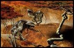
 Where is the Guardian? Où est le Guardien? Is it really the Guardian? C'est vraiment le Guardien?
 Dungeon Donjon Here is the Guardian!
Voilà le Guardien!
Note that I love purely textual RPG or adventure games as there are a bunch of fantastic one coming from the Dark Ages.
But focusing the advertising on the graphics is an example of a typical publisher twist to subtly fool the poor customer.
Rule: always wait and read an independant review before buying anything!
(who has said "Fallout 3"? nobody? ok, that's fine).
Recommendation: "??" (do you know independant U.S. and U.K video games magazines?). Attention! J'adore les jeux d'aventures ou les RPG purement textuels, n'allez pas croire le contraire: il y a tellement d'exemples fantastiques venant des Ages Sombres. Mais concentrer uniquement la publicité de cette façon est un exemple typique d'entourloupe éditoriale pour induire subtilement en erreur le pauvre client.
Règle: toujours attendre et lire un test indépendant avant d'acheter quoi que ce soit! (qui a dit "Fallout 3"? personne? J'avais cru).
Recommandation: "Canard PCoff". So, we have a trade-off between:
- advertising without any screenshots at all... and a lot of pending questions!
- advertising with typical ingame screenshots... allowing a better choice (but not always the best, surely)
C'est donc un compromis entre:
- les publicités sans capture d'écran... et beaucoup de travail d'imagination, voir de questions en suspens!
- les publicités avec des captures d'écran représentatives... permettant un choix plus éclairé (mais pas nécessairement le meilleur, bien évidemment)

Game box / Boîte du jeu
Game/Jeu: Temple of Terror.
Publisher/Editeur: U.S. Gold.
Artwork/Illustration: Chris Achilleosoff ("Guardian Of The Gate").
Platforms/Plateformes: Commodore 64, ZX Spectrum, BBC Micro.
Date: 1987.
Links/Liens: [MobyGames] [Lemon]
_______________________________
Related articles/Articles associés: votre commentaire
-
 The work of Chris Achilleosoff has been first discovered with Bloodwych and we will follow this artist here with another contribution.
The game Barbarian II presents a typical drawing from Chris, a realistic Fantasy artwork.
As a lot of impressive game artwork, it is a very colorful one and I will not comment more the work of Chris, as it is quite an evidence by itself.
However, we will take it to introduce a famous actor in the game industry, the Psygnosis company.
The Barbarian II advertising shows the main elements of every advertising coming from Psygnosis: black background, multiple rectangular areas clearly separated by a red border, one for the artwork, some for the ingame screenshots, one for the company logo, one for the address and finally one for the game comment. The layout is clear and allow a complete presentation. Perfect score!
One moto from Psygnosis is "Seeing is believing" and we can say that it is really true for this company!
The first objective was to produce mainly graphically appealing games and put a massive effort of the ingame style to build progressively the reputation of the company. This is why it was possible to put ingame screenshots on the advertising, a simple but effective thing that a lot of competitors have chosen to avoid. For them, the beautiful advertising was far from the quality of the game; for Psygnosis this was not a lie.
A logical consequence has been to ask famous artists to produce impressive cover artwork for these games or buy some already existing drawing. Doing such thing for each game can be quite expensive but the resulting quality is far from the majority of other companies.
This way has been proved to be the right choice as a lot of Psygnosis games were a success on the market and every "old" gamers remember it for the quality of their products.
It will also allow us to introduce later a very very famous artist, more closely linked with Psygnosis and its success, Roger Deanoff.
But it's another story for another post.
Nous avons découvert le travail de Chris Achilleosoff avec Bloodwych et nous ne pouvons que continuer à suivre les autres contributions de cet artiste, notamment "Barbarian II".
Ce jeu présente le style typique de Chris: une Fantasy réaliste.
Comme beaucoup d'autres percutante couverture de jeu, il est très coloré, et je ne vais pas m'étendre plus sur l'analyse du travail de Chris, qui se suffit pleinement à lui-meme.
Malgré tout, nous allons l'utiliser pour introduire ici un des plus fameux acteurs de l'industrie du jeu (à l'époque), à savoir la société Psygnosis.
La publicité de Barbarian II montre les éléments principaux de quasiment toutes les publicités réalisées par Psygnosis: un arrière plan noir, de multiples zones clairement séparées par une bordure rouge, une zone pour le travail d'artiste, quelques unes pour les images pendant le jeu, une autre pour le logo de la société, une pour l'adresse, et pour finir une pour les commentaires sur le jeu. La mise en page est claire et autorise une présentation très complète et percutante: un score parfait!
Un des leitmotiv de Psygnosis est "Voir, c'est croire" et c'est la stricte vérité pour cette société! Voir le jeu, c'est avoir envie d'y jouer. L'objectif premier était de produire des jeux attirants graphiquement parlant et de mettre un effort conséquent dans le style, l'ambiance du jeu lui-même, pour se construire progressivement une solide réputation. C'est pour cela qu'il était possible de mettre des images du jeu sur la publicité, une chose simple et efficace que beaucoup de concurrents avaient choisi d'éviter parce qu'ils ne pouvaient pas se le permettre. Pour eux, leurs superbes publicités ne correspondaient pas à la médiocre qualité de leurs jeux; pour Psygnosis, la publicité n'était pas un mensonge.
Une conséquence logique a été de demander à des artistes réputés de produire d'impressionants dessins pour les couvertures de ces jeux ou bien d'acheter les droits sur des dessins deja existants. Faire çà pour chaque jeu peut se révéler assez cher mais la qualité finale est de ce fait loin de celle d'une majorité d'autres compagnies. Cette direction a d'ailleurs prouvée qu'il s'agissait d'un choix judicieux car beaucoup de jeux Psygnosis ont été des succès commerciaux et tous les "vieux" joueurs s'en souviennent encore avec nostalgie.
Cela nous permettra aussi d'introduire plus tard un autre artiste très réputé, encore plus lié à Psygnosis et son succès, Roger Deanoff.
Mais c'est une autre histoire pour un autre article.

Game box / Boîte du jeu Note that this artwork has been use also for the cover of a Fantasy novel: Notez enfin que ce dessin a été aussi utilisé pour un livre de Fantasy:
"The War of Powers" [Robert E. Vardeman / Victor Milan].
Game/Jeu: Barbarian II.
Publisher/Editeur: Psygnosis.
Cover art/Illustration: Chris Achilleosoff.
Platforms/Plateformes: Amiga, Atari ST.
Date: 1991.
Links/Liens: [HOL] [Lemon]_______________________________
Related articles/Articles associés: votre commentaire
-

Here is a game which was totally out of my memory!
What a shame... 3 simultaneous players, up to 8 in tournament, speed, addictive,
with colorful and efficient graphics: a crossover between speedball and hockey.
As my memory is now partially recovered on this topic, it reminds me the hours spent and associated pleasure!
Seeing its advertising with the same sort of qualities is an unexpected bonus!
Voilà un jeu qui était complètement sorti de ma mémoire!
Et pourtant... jeu à 3 joueurs en simultané, tournoi jusqu'à 8, fluide, prenant, avec des graphismes colorés et efficaces: une sorte de speedball croisé avec du hockey.
Plus la mémoire revient, plus je me rappelle les heures passées dessus et le plaisir associé!
Voir que sa publicité possède les mêmes qualités est un bonus inattendu!
First impressive characteristic: colors.
There are a lot of them, strong and various, bringing a touch of levity.
However, the main palette remains focused on yellow and orange, giving an impression of energy, of move and a feeling of danger.
All these colors suggest a brutal but not so dramatic game, like a sport game, completely different from a war game.
We have a confirmation with the "American football"-style clothing used for the main guy.
Première caractéristique frappante: les couleurs.
Il y en a beaucoup, très vives et diverses, apportant une note de légèreté.
La palette dominante reste pourtant centrée sur le jaune et l'orange, donnant une impression d'énergie, de mouvement et de danger.
Toutes ces couleurs nous suggèrent donc un jeu violent mais plutôt sportif, différent d'un jeu de guerre.
La tenue du style "football americain" du personnage renforce ce point.

Second characteristic: a sharp and design advertising.
The title is wrought, the ball is stylized, surrounded by black concentric circles.
It is a real artistic effort and this style is opposed to the central character, a lot
more realistic.
Add the white border around this character, and everything is done to bring him to the light.
Everything seems precise, clean and the concept of game, of having fun in the game, is reinforced.
Deuxième caractéristique: des formes graphiques et précises.
Le titre est travaillé, la balle est stylisée, entourée de cercles noirs concentriques.
C'est un vrai effort artistique et ce style s'oppose à celui du personnage central, beaucoup
plus réaliste, mais pourtant tout aussi travaillé.
Ajoutez à cela le liseré blanc qui détoure ce personnage, et tout est fait pour faire ressortir
celui-ci.
Tout parait précis, net et l'aspect jeu, plaisir de jeu, en est encore renforcé.

Finally, the frame at the bottom is not insignificant at all, as the P-47 one could be.
It reinforces discreetly all of these features by showing arena, 3 atmospheres, 3 colors.
The commercial data are here but stay at their place and do not affect at all the whole image.
Enfin, l'encart du bas n'est pas insignifiant, comme pouvait l'être celui de P-47.
Il renforce discrètement toutes ces caractéristiques en montrant des arènes, 3 ambiances, 3 couleurs.
Les informations commerciales sont là mais restent à leur place et ne gênent pas du tout
l'ensemble.

Game box / Boîte du jeu
Note: a beautiful poster of this advertising exists inside the box of the Amiga release.
Note: il existe un magnifique poster de cette publicité, dans la boite de la version amiga!
Game/Jeu: Projectyle.
Publisher/Editeur: Electronic Arts.
Cover art/Illustration: Planet X.
Platforms/Plateformes: Amiga, Atari ST.
Date: 1990.
Links/Liens: [HOL] [Lemon]
votre commentaire
-
 I have magnificent memories of this advertising!
An elegant choice of colors, using an analogous color scheme of warm tones (yellow, orange) and an almost complementary analogous color scheme around the blue color (purple to light blue), bringing a high contrast and a vibrant look.
The warm scheme underlines the sunset, highlights the title of the game, reminds us the colors of the explosions and the nose of the plane.
If this nose uses itself a warm tone, it means that it will brings the danger with him.
In front of these feelings is the other part of the adverstising, covered with snow, in the shadow, using cold tones. Nevertheless, the purple color, not far from the warm tones, reminds that this place can sink into the violence of the bombardments of the P-47. This is confirmed by the position of the plane, showing clearly that it will return again and again above the train to bombard it.
Let us notice that the train has also 3 little yellow parts, its lighthouses: a promise of military answer? An embedded dca? A potential enemy of the P-47 in the game, without any doubt.
The train and the plan are parallels, exposing them to our glances: this P-47 is the title of the game and its main element, it would have been a shame to not see it like this!
Un souvenir magnifique que cette publicité!
Un élégant choix des couleurs, utilisant une composition analogue de tons chauds (jaune, orange) et une composition analogue quasiment complémentaire autour du bleu (de violet à bleu clair). apportant un très bon contraste.
La composition chaude souligne le soleil couchant, rehausse et découpe le titre du jeu, propose un rappel aux couleurs des explosions et du nez de l'appareil.
Si ce nez se pare d'un ton chaud, c'est pour indiquer le danger qu'il amène.
Face à ces impressions s'oppose tout le reste, enneigé, à l'ombre, avec les tons froids. Malgré tout, le violet, plus chaud tout de même, rappelle que cet endroit peut/va sombrer dans la violence des bombardements du P-47. Ce qui est confirmé par la position de l'appareil, montrant clairement sa volonté de revenir encore et encore sur le train pour le pilonner.
Remarquons que le train possède tout de même lui aussi 3 points de jaune, ses phares: une promesse de réponse militaire? Une dca embarquée? Un ennemi potentiel du P47 dans le jeu, à n'en pas douter.
Le train et l'appareil sont à cet instant précis parallèles, permettant de bien les exposer à nos regards. Ce P-47 étant le titre du jeu et son élément principal, c’est la moindre des choses !
P-47 Thunderbolt (Amiga)
The frame containing the comments concerning the game (the story, the platforms and the publisher) is nearly outside of the main part, the action. Its extreme discretion underlines that the image is self-sufficient: it explains everything. This frame would have been omitted without any problem, as the evocation brought by the graphic composition is so powerful.
Le cadre avec les commentaires concernant le jeu (histoire, plateformes, éditeur) est discret, et n'empiète pas sur le tableau général. Sa discrétion extrême souligne que l'image se suffit à elle-même: elle explique tout. Ce cadre aurait ainsi pu être omis sans aucun souci, tellement l'évocation amenée par la composition graphique est puissante.

P-47 Thunderbolt (Spectrum)
The game is not considered to be a hit but I always wanted to play it one day, due to this advertising, whatever the comments read here or there. Impossible to know if the P-47 is going to fulfill its mission but the advertising fulfilled its own one easily!
Le jeu en lui-même n'est pas réputé pour sa qualité mais cette publicité m'a toujours donné envie d'y jouer un jour, qu'importe les commentaires lus ici et la. Impossible de savoir si le P-47 va remplir sa mission mais la publicité a remplie la sienne haut la main!
P-47 Aces (Arcade)
Historically coming from the Arcade (thanks to Jaleco), the game has been ported on many platforms (thanks to Firebird), offering very correct graphics on Amiga and something more "simple" on Spectrum, to end by another episode in 1995, P47 Aces, on Arcade.
Historiquement venant de l'arcade (grâce à Jaleco), le jeu se retrouve sur beaucoup de plateformes (grâce à Firebird), offrant des graphiques très corrects sur Amiga à quelque chose de plus difficile de nos jours sur Spectrum, pour finir par une suite en 1995, P47 Aces, sur Arcade.

Game box / Boîte du jeu
Game/Jeu: P-47 Thunderbolt, P-47 The Freedom Fighter, P-47 The Phantom Fighter.
Publisher/Editeur: Firebird (Jaleco / Arcade).
Cover art/Illustration: Artistix London.
Platforms/Plateformes: Arcade, Amstrad CPC, Atari ST, C64, Amiga, PC-Engine, DOS, ZX Spectrum.
Date: 1990 (1988 / Arcade).
Links/Liens: [HOL] [Lemon]
votre commentaire
-
 This advertising is a masterpiece, created by a well known artist, Chris Achilleosoff.
The title and Chris' drawing are awesome, but the remaining of the advertising seems poor in comparison, with nearly one half taken by a quite ugly text in red and white, plus all prices for supported platforms. The drawing could have been placed in the center, given its importance, but the advertising appears unbalanced by an overload of tiny text on the bottom half.
When seeing what have been done for the similar "commercial" part of the Extase advertising by Cryo, we clearly understand now that paying a great artist is not enough.
The chance here for Image Works is the level of quality of the Chris' drawing, which is hiding everything else around and we will soon only remind us the best part. Cette publicité est un chef d'oeuvre, créé par un artiste réputé, Chris Achilleosoff.
Le titre et le dessin de Chris sont superbes, mais le reste de la publicité semble bien pauvre en comparaison, avec près de la moitié occupée par des textes rouge et blanc, assez hideux, accompagnés par la liste des prix sur toutes les plateformes disponibles. Le dessin aurait pu se placer au centre, vu son importance, mais l'ensemble parait déséquilibré par la surcharge de texte illisible sur la moitié basse.
En voyant ce qui a été fait pour la partie "commerciale" équivalente de la publicité de Cryo pour Extase, nous comprenons clairement maintenant qu'embaucher un grand artiste n'est pas suffisant.
Ici, la chance pour Image Works reste le niveau de qualité du dessin de Chris, qui éclipse tout ce qui peut se trouver autour de lui. De fait, nous ne nous souviendrons bientôt que de la meilleure partie. Have a look at this picture without game related data, to fully appreciate the work: Jetez un oeil sur le dessin, sans tout ce qui concerne le jeu en lui-même, pour apprécier pleinement le travail:

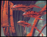
The Crystal Guardian - Chris Achilléos - 1989 The 3 sources of lights (behind, the crystal and the hole) allow a wide range of colors in the selected palette and a lot of effects playing with dark and light. Again, the red dominant color is a great choice here in this context, as done for Extase and Knight Force also, and a must to express the power, force, violence, danger of a dragon.
Indeed, the monster seems to be a crossover between a human and a dragon, with a not-neutral attitude and armor. It allows our imagination to already put in place some parts of the game: perhaps a corruption from the crystal, like the precious ring of Gollum, transforming human into dragon or monster, feeling reinforced by the profusion of growths on the monster, in a disorderly fashion, erratic, but also through the use for this element of a monochromatic selection of blue colors, cold, inspirating a strange and corrupting light; perhaps huge fights if such attitude and armor are needed; promises of brutality, energy with all its barbs, horns, claws; surely some blood (red color) and flame (yellow color).
All of these dreams are a great call to Adventure! And Bloodwych is a damn good game to have adventure, with 2 players simultaneously on the same splitted screen, if you are able to ignore quite not-so-exciting graphics and no sound at all. Les 3 sources de lumière (derrière, venant du cristal et du trou) autorise un large éventail de couleurs dans la palette sélectionnée et beaucoup d'effets jouant avec l'ombre et la lumière. Encore une fois, la couleur dominante rouge est un très bon choix dans ce contexte, comme c'était aussi le cas pour Extase et Knight Force, et un incontournable pour exprimer la puissance, la force, la violence, le danger, véhiculé par un dragon.
En effet, le monstre ressemble à un croisement entre un humain et un dragon, avec une attitude et une armure loin d'être neutres. Grâce à tout ça, notre imagination travaille déjà à mettre en scène à l'avance des aspects du jeu: peut-être une corruption venant du cristal, telle que celle de l'anneau de Gollum, transformant un humain en dragon ou monstre, impression renforcée par la profusion d'excroissances présentes sur le monstre, de façon désordonnée, erratique, mais aussi par l'utilisation pour cet élément d'un camaïeu de bleu, couleur froide, inspirant une lumière étrange, corruptrice; peut-être des combats acharnés si une telle attitude et une telle armure sont nécessaires; des promesses de brutalité, de coups énergiques avec toutes ses piques, cornes, griffes; à coup sûr du sang (le rouge) et des flammes (le jaune).
Tous ces rêves sont un puissant appel pour l'Aventure! Et Bloodwych est un très bon jeu pour obtenir sa dose d'aventure, avec 2 joueurs en simultané sur un écran splitté, si vous êtes capable d'ignorer des graphismes assez pauvres et une absence presque totale de son.
Now imagine the nightmare of game artists to convert Chris' work, using restrictions of the respective machines!? Here are the trials:
Maintenant, imaginez le cauchemar des graphistes du jeu pour convertir ce dessin, étant limités par les restrictions des machines respectives!? Voilà les essais: 

Amiga / Atari (16 bits) DOS (16 bits) 

Amstrad CPC (8 bits) Commodore 64 (8 bits) 
ZX Spectrum (8 bits) The limitations of the different machines are obviously not the same (number of colors, etc.) and for each of them, the result is not so bad at all. The only negative comment is about the green color artificially added on the DOS version, a color completely out of the palette, with mainly warm colors for the monster, creating an ugly break in the image harmony. Les limitations des différentes machines ne sont évidemment pas les mêmes, telle que le nombre de couleurs, mais pour chacune, le résultat final n'est pas si mal. Le seul commentaire négatif que nous pourrions faire concerne l'étrange couleur verte, artificiellement ajoutée sur la version DOS, une couleur complètement en dehors de la palette essentiellement chaude du monstre, créant une nette brisure dans l'harmonie de l'image. Here is an ingame screenshot (Amiga): Voici un écran de jeu (Amiga): Finally, note that Chris Achilleos has deployed his talent on the following other games:Finalement, notez que Chris Achilleos a déployé son talent sur les autres jeux suivants: These games will surely be posted later as the quality remains impressive. Ces jeux seront sûrement publiés plus tard, étant donné la qualité de l'ensemble.
Game box / Boîte du jeu
Game/Jeu: Bloodwych.
Publisher/Editeur: Image Works.
Cover art/Illustration: Chris Achilleosoff.
Platforms/Plateformes: Amiga, Atari ST, DOS, Amstrad CPC, C64, ZX Spectrum.
Date: 1989.
Links/Liens: [HOL] [Lemon]_______________________________
Related articles/Articles associés: votre commentaire
Don't forget lessons from the past! N'oubliez pas les leçons du passé!
-
 Between the time when Pong was exciting, and the rise of the casual gaming, there was an age undreamed of.
And onto this, The 8/16 bits Era, destined to wear the jeweled crown of gaming upon a troubled brow.
It is I, his chronicler, who alone can tell the saga of RetroGame Art.
Let me tell you of the days of high adventure!
 Entre le temps où Pong était passionnant et l'avènement du casual gaming, il y avait un âge oublié.
Et dans cet âge trouble, L'Ere 8/16 bits, destinée à porter la couronne de joyaux du jeu.
C'est moi, son chroniqueur, qui seul peut vous parler de la saga de l'art dans le retrogaming.
Laissez-moi vous narrer ces jours d'aventures épiques!
-
Any comment are welcome. You can contact the author here: Tous les commentaires sont les bienvenus. Vous pouvez contacter l'auteur ici:


