


-
The Killing Game Show
 Go to English text
 Lire l'article en Français English version
Advert.
Some old memories come back... gradually resurface.
One eye. A frightening eye. A dull distress.
The game may be unknown, but the memory of this advert is here. Now.
Buried, but ready to see the light, followed by the same past questions. These questions are now quite old but they are still here, with the same accuracy. It means that the following paragraphs have not been written for old people and can target a wider audience. These are not stories that less-than-30-years-old guys cannot understand! Welcome on board, folks!
Ok, so... Here is Tim Whiteoff with his drawings once again.
The place is well-known to us, all the more because we find again the already mentioned (see Infestation article) layout, specificially used by the games of the publisher Psygnosis. Red and black frames -clearly separated-, global clarity, multiple areas: illustration, screenshots, logo, address of the publisher, informative text about the game. Always effective. If you want a flight of lyricism about Psygnosis, please, wait some time: we will tackle other works published by this company in later articles, works that will probably be more suitable for a cheerful speech than this one.
For our young readers, for the old one with a bad memory, for the aged who have just discovered the Internet, or simply those who had enough common sense to not waste their time in such decadent and degenerate leisure, we will try a bit harder to introduce the story. And this introduction will help us to enlighten them about the remaining explanations in the article.
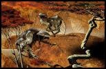
We are dealing with a television show in which a convicted prisoner try to save one's hide and leave a maze filled with deadly traps, all the more stressful because a liquid gradually rises, continuously requiring to take flight. The player will be involved in a mix between platform, reflection and shoot'em up gameplays. A remarkable point is the opportunity to rewind the last seconds before his own death to regain control of the command just before the fateful moment and be able to modify the strategy.


Amiga Intro Amiga
Illustration.
If we forget the ubiquitous black color, we are immediatly caught by a surprising blue, multiple blue colors in fact, nearly metallic and, for sure, unexpected.
The choice is nevertheless relevant compared to the main color of the in-game decor and the hero itself, also blue.
Thus the whole is cold, with a disturbing atmosphere: the intention is clear.
Let's tackle the main piece, which is located in a relatively small part of the advert: a surprisingly realistic eye.
Realistic... It only seems to be realistic, because the focus must be put more on the reflection seen inside the pupil. And what we see is rather strange. Look at the bigger version of this pupil on the image below.
Small part, but many details.
The title of the drawing from Tim Whiteoff, "Devil on the Island", greatly gains recognition.

What is the meaning of this eye?
Everyone will see what he wants but, here, we think that it can be:
- the eye of the hero, who sees (hence the reflection in the pupil) the island, where will begin the game. The test is demoniac (shady and cruel tv show) and fatal for him: it explains the devil.
- the cameras of the TV show, the ubiquitous eye of the real-TV.
- the members of the audience, behind their TV, fascinated by the morbid side.
- the player himself?
And the water?
The water around the island reminds us the liquid that gradually rises.
And the devil?
The devil is the designers of the TV show, the cruelty of the game, the cruelty of the audience, the sentence for the convicted prisoner, the planned death of the player.
And ... <reader> Oh man, enough questions. I do not want to think too much when I read a blog, understand?</reader>
This eye, which is looking at the death and the devil, is the player during the rewind, watching the sequence where he died, to be able to perhaps modify the fatal end.
For you, audience. (<= a wink to a French comic, Franck Dubosc)
But it is also the look of the audience. He is looking at oneself, the darkness of his evil and soul, reflected in the pupil: it is a perfect picture of the frame of mind of real-TV spectators today. Perverse desire to watch others struggling and Will to be delighted about it.
Here, we are players and spectators at the same time: therefore we take pleasure on one side to watch, to desire and on the other side to fear, to postpone, to overcome our own death. The whole spirit of video games, where the hero uses "lifes", is represented by this eye. Don't worry, such principle is completely natural: a challenge is a challenge only because it is difficult to achieve. No need to see darker intentions. However, this principle must be moderated, depending on the targeted audience.
Before introducing this necessary nuance, let's take the time to digress about the title to accumulate more arguments.

Title.
A lettering from Roger Deanoff, once more. A lot of work in this simple title, with multiple shades of blue color, to remind us the eye and the game. There is also a touch of red, completely flooding the K, and splashings on the other letters.
The style of the font is unkindly, rough-hewn, made only with straight lines.
This is a superb illustration of the word "Killing", embedded in the title: there will be tough battles, a desesperate escape, injuries, blood for sure, and perhaps the death at the end, in a technological and scary place.
Killing (devil, red color) Game (the Island, the playground) Show (the eye).
An illustration that seems strange at first sight (just one eye), without clear goal, is gradually showing its meaning.
An illustration that seems simple at first sight (just one eye), decomes complex, subtle when looking at the details.

Boite du jeu (Amiga)

Game box (Sega Megadrive)
Low-perversion.
We better understand why the port of this game on the Sega Megadrive has been obliged to be modified. The modification may seem minor but indeed clearly relevant, based on our analysis. The illustration from Tim Whiteoff has been replaced by one from Roger Deanoff and the title has been forgotten in favor of "Fatal Rewind" (which is a reminder of the in-game feature allowing to replay the last moments before a failure).
We stay not very far from the violence (Fatal, menacing giant robot), but probably Sega was not ready to keep the diabolical dimension, the perverse mix between game, violence and shady voyeurism, in a game designed for the young audience of the console. Here is our nuance. What could have been an unacceptable interference becomes a proof of wisdom and common sense, as the main target has not yet the strenght to portect themselves from these influences. The game itself has not suffered from any censorship, which is a good reason to not be offended at all at the end.
Goal.
Choice of appropriate, appealing drawing, which is all the more surprising as it was not specifically created for this game, but for a french film published by "Images 7 France", "Devil on the island". By the way, impossible to find a reference to this film: if you have more information, I will take it. Our analysis is also perhaps more interesting in the context of the game than the film. In any case, we do not try to find with KGS what was the goal of the artist but the publisher only. Who is the most devious od the two, then?
Game: The Killing Game Show (Fatal Rewind / Sega).
Illustration: Tim Whiteoff (Roger Deanoff / Sega).
Lettering: Roger Deanoff.
Publisher: Psygnosis.
Platforms: Amiga, Atari ST, Sega Megadrive/Genesis.
Date: 1990.
Links: [HOL] [Lemon]
_______________________________
Related items: Version Française
Publicité.
De vieux souvenirs remontent... refont progressivement surface.
Un œil. Un œil inquiétant. Une angoisse sourde.
Le jeu est peut-être inconnu mais le souvenir de cette publicité est là. Présent. Enfoui, mais prêt à revenir, accompagné des même questions qu’à l’époque. Ces questions sont maintenant vieilles mais elles se posent toujours, avec autant d’acuité. Preuve que les quelques lignes qui vont suivre ne sont pas seulement des radotages de vieux et peuvent interpeller un public plus large. Ce ne sont pas des histoires que les moins de 30 ans ne peuvent pas connaître ! Bienvenu à tous !
Revoilà donc Tim Whiteoff dans ses œuvres et non des moindres.
Le terrain est d’autant plus connu que nous retrouvons la mise en page déjà évoquée dans Infestation, caractéristique des jeux de l’éditeur Psygnosis. Cadres rouges et noirs, clairement séparés, clarté de l’ensemble, plusieurs zones : illustration, captures d’écran, logo, adresse de l’éditeur, texte informatif sur le jeu. Toujours efficace. Si vous voulez une envolée lyrique sur Psygnosis, un peu de patience : nous aborderons dans des articles ultérieurs d’autres travaux édités par cette société, travaux dont l’ambiance se prêtera surement plus à un discours enjoué que celui-ci.
Pour les jeunes, les vieux à mémoire défaillante, les très vieux qui viennent juste de découvrir Internet, ou tout simplement ceux qui avaient le bon sens de ne pas perdre leur temps dans des loisirs décadents et dégénérés, il va falloir faire un effort de présentation. Une présentation qui va nous aider pour éclairer la suite de nos propos.
Nous avons affaire à un show télévisé dans lequel un condamné essaie de sauver sa peau en sortant d’un labyrinthe rempli de pièges mortels, rendu d’autant plus stressant qu’un liquide monte progressivement et oblige à une continuelle fuite en avant. Le joueur aura droit à un mélange de plateforme, de réflexion et de shoot’em up. Un point notable est la possibilité de revoir les derniers instants avant sa mort pour reprendre le contrôle avant l’instant fatidique et changer de stratégie.
Amiga Intro Amiga
Illustration.
En mettant de coté la couleur noire omniprésente, évidente, on accroche immédiatement sur un bleu surprenant, des bleus en fait, métalliques, inattendus.
Le choix est pourtant pertinent face à la couleur dominante des décors et du héro du jeu, bleu eux-aussi.
L’ensemble est donc froid, l’ambiance inquiétante : le ton est donné.
Attaquons le morceau principal, qui se situe pourtant dans une assez petite partie de la publicité, à savoir un œil, étonnamment réaliste.
Réaliste... en apparence seulement, car l’intérêt de ce morceau principal se focalise sur le reflet présent dans la pupille. Regardez bien le zoom de cette pupille sur l’image qui suit.
Petite partie, beaucoup de détails.
Le titre du dessin de Tim Whiteoff, « Devil on the Island », s’impose de lui-même.
Que représente cet œil ?
Chacun y verra ce qu’il veut mais nous, nous y décelons :
- l’œil du participant principal, qui voit (d’où le reflet sur la pupille) cette île où va se passer le jeu. L’épreuve est mortelle pour lui, voir démoniaque (jeu télévisé glauque, cruel) : d’où le diable.
- les cameras du jeu télévisé, l’œil omniprésent de la télé-réalité.
- les spectateurs derrière leur télé, fascinés par l’aspect morbide.
- le joueur lui-même ?
Et l’eau ?
L’eau autour de l’île rappelle le liquide qui monte progressivement.
Et le diable ?
Le diable représente les concepteurs du show, la cruauté du jeu, la cruauté des spectateurs, la sentence prononcée pour le condamné, la mort annoncée du joueur.
Et le... <lecteur>Oh, ça va les questions. Je n’ai pas envie de réfléchir quand je lis un blog, moi</lecteur>
Cet œil qui regarde la mort, le diable, c’est le joueur en plein rewind, qui regarde la séquence où il est mort pour la modifier.
Pour toi, public.
Mais c’est aussi le regard du public. Il se regarde lui-même, la noirceur de son âme, diabolique, réjouie, qui se reflète dans la pupille : c’est une bonne représentation de l’état d’esprit des spectateurs de télé-réalité actuelle. Désir pervers de regarder d’autres se débattre et volonté de s’en réjouir.
Ici, nous sommes joueur et public en même temps : nous prenons donc plaisir à regarder, désirer et à la fois craindre, repousser, surmonter notre propre mort. Tout l’esprit des jeux où le héro consomme des « vies » est représenté par cet œil. Rassurez-vous, le principe est des plus naturel : un défi ne l’est que parce qu’il est difficile à atteindre. Point besoin de voir des intentions plus sombres. Pour autant, ce principe doit être nuancé, allégé selon le public touché.
Avant de présenter cette nécessaire nuance, prenons le temps d’une digression sur le titre pour accumuler des arguments en sa faveur.
Titre.
Un lettrage de Roger Deanoff, encore. Beaucoup de travail dans ce simple titre.
Tout en nuances de bleu encore, pour rappeler l’œil et le jeu, mais avec aussi une touche de rouge, inondant totalement le K, et des éclaboussures sur les autres lettres.
Le style de la police de caractères est rude, taillé à la serpe, fait uniquement de lignes droites.
Superbe illustration du mot « Killing » contenu dans le titre : il y aura de rudes batailles, une fuite éperdue, des blessures, du sang à coup sûr, et peut-être la mort au bout, dans un espace à dominante technologique, angoissant.
Killing (diable, rouge) Game (l’ile, terrain de jeu) Show (l’œil).
Une illustration qui parait de prime abord curieuse (juste un œil), sans signification claire, prend peu à peu tout son sens.
Une illustration qui parait de prime abord simple (juste un œil, réaliste), devient complexe, subtil, dans le détail.
Boite du jeu (Amiga)
Boite du jeu (Sega Megadrive)
Allégé en perversion.
On comprend ainsi mieux pourquoi le portage de ce jeu sur Sega Megadrive a subi un changement qui peut paraître mineur, mais pertinent au regard de notre analyse. L’illustration de Tim Whiteoff a été remplacée par un dessin de Roger Deanoff et le titre oublié au profit de « Fatal Rewind » (rappel à la possibilité de revoir les instants d’avant notre échec dans le jeu lui-même).
On reste dans une thématique de violence (Fatal, robot géant menaçant) mais Sega n’a sans doute pas voulu conserver la dimension diabolique, l’amalgame pervers jeu+violence+voyeurisme glauque, pour un jeu destiné à un public console, jeune. Voilà notre nuance. Ce qui aurait pu apparaître comme une ingérence inacceptable, devient une preuve de maturité et de bon sens, quand la cible privilégiée n’a pas encore les moyens de se protéger de ces influences. Le jeu lui-même n’ayant pas subi de censure, il n’y a donc pas lieu de s’en offusquer.
Intention.
Choix de dessin pertinent, attirant, ce qui est d’autant plus surprenant qu’il n’a pas été fait pour ce jeu précisément, mais pour un film français édité par « Images 7 France », « Devil on the island ». Au passage, impossible de retrouver une référence à ce film : si vous avez plus d’informations, je suis preneur. L’interprétation est d’ailleurs peut-être plus intéressante dans le cadre du jeu que du film, et en tout cas, pour KGS, ne préjuge pas des intentions de l’artiste, mais de l’éditeur uniquement. Qui est donc le plus retors des deux, alors ?
Jeu: The Killing Game Show (Fatal Rewind / Sega).
Illustration: Tim Whiteoff (Roger Deanoff / Sega).
Lettrage: Roger Deanoff.
Editeur: Psygnosis.
Plateformes: Amiga, Atari ST, Sega Megadrive/Genesis.
Date: 1990.
Liens: [HOL] [Lemon]
_______________________________
Articles associés:
 Tags : letter k, the killing game show, kgs, tim white, psygnosis, 1990, amiga, atari, sega megadrive
-
Commentaires
Don't forget lessons from the past! N'oubliez pas les leçons du passé!
-
 Between the time when Pong was exciting, and the rise of the casual gaming, there was an age undreamed of.
And onto this, The 8/16 bits Era, destined to wear the jeweled crown of gaming upon a troubled brow.
It is I, his chronicler, who alone can tell the saga of RetroGame Art.
Let me tell you of the days of high adventure!
 Entre le temps où Pong était passionnant et l'avènement du casual gaming, il y avait un âge oublié.
Et dans cet âge trouble, L'Ere 8/16 bits, destinée à porter la couronne de joyaux du jeu.
C'est moi, son chroniqueur, qui seul peut vous parler de la saga de l'art dans le retrogaming.
Laissez-moi vous narrer ces jours d'aventures épiques!
-
Any comment are welcome. You can contact the author here: Tous les commentaires sont les bienvenus. Vous pouvez contacter l'auteur ici:

Kurumsal ve Bireysel SEO Hizmetleri Sunan Ekibimiz ile İletişime Geçebilirsiniz.