


-
Amnios
 Go to English text
 Lire l'article en Français
 As we go on with articles about Tim Whiteoff, we are once more bound to the publisher Psygnosis. It is consequently not a surprise if the layout of this advert presents the classic look-and-feel of the company, even if we have here a specific division for each sections. Such specificity will in fact increase our repository of Psygnosis-style layouts, repository initiated with the article about the game Obitus.

A remarkable point to note is the number of screenshots. There are so much of them that the advert seems to be nearly entirely filled by the illustration and the screenshots. The will to put the focus on the visual impact is undeniable and shows a great confidence in the graphical quality of the game itself. This high number of images associated with the typical clarity of such layout, generates immediately a very positive global impression.

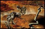
The figure is therefore based on a painting by Tim White, named "Dragon drone".
We find here a mountainous, rugged and misty landscape, two moons, and a palette of cold colors, dominated by a gradient of green/blue tones.
Strange, strange...
When everything is under the supervision of a cross-over between a plane and a reptile with a threatening "face", the feeling of strangeness is tainted with fear also.
Besides, are we dealing more with a reptile or a craft?
On this topic, the advert is much more decisive than the cover of the game, the latter showing us an additional part, to the right, exposing the "tail" of the spaceship. The circumvolutions of this tail seem to be so animal that the initial question is now even more relevant and the conclusion tends to be more and more close to a real mix of the two.
The artistic study of the illustration is therefore more meaningfull through the advert than through the cover.
The explanation about the kind> of the machine is located inside the game, where we are just put in a spaceship stemed from the latest technology, combined with alive genetic tissues. Strangeness becomes Fantasy.
The realism of the picture and the preciseness of the details make the whole probable and frightening at the same time.
This illustration has definitively acquired its status of majestic, evocative and powerful painting!

Go on with the title, "Amnios".
Feel this particular calligraphy... Go ahead... Don't be afraid... Touch these rounds, these peaks, these sharp turns... Breathe these colors...
There are some traces of Roger Deanoff in the air, don't you think so? No credit in the manual to confirm it but I take the bet (if you have first-hand information, I'm interested).
Peaks and sharp turns evoke the rugged and mountainous landscape.
Colors stand out with their warmth and the main orange tones, from yellow to red, the whole separated by a black line.
These warm colors announce a promise of battles and violence.
The black line, dashed, is like the rugged surface of the world.
The letters are cut with fragmented sides: this is the fog that hides part of the landscape, the uncertain world where we are going and perhaps even the damage caused by the blows that we will probably take.
Outstanding work, all in subtleness and preciseness... again.
The interest in using the talents of a professional calligrapher can no longer be questioned and this assertion is gradually justified by the accumulation of prowess already analyzed (Obitus, The Killing Game Show) and the one to come (Shadow of the Beast).

For once, the in-game title doesn't take the hard work done for the cover and offers a more direct interpretation, quite evocative also but less subtle, even if there is a great level of details.
How to be visually simple (and thus readable) but meaningful and elaborated?
That's the beauty of this work on the cover and the art of Roger Dean.
Nice try in game but the competition is too strong:)
Again, Psygnosis offers an impressive visual, full of contrast between a drawing of a fantasy world rather calm but anxious and a more incisive, violent title.
Beauty, anguish and fight.
It makes you impatient, right?


Amnios is a shmup (shoot them up) which has been acclaimed, visually superb, providing a difficult challenge and a rich gameplay for this style of game.
We add a travel at 360 degrees, an organic and alive planet to be fought against, the handling being the only point to be forgotten.
The game, through its history and its design, is in complete harmony with the cover and advert. The most surprising is that the first backer of the painting does not seem to be Psygnosis (note 1)! The harmony is then even more impressive.
Game: Amnios
Illustration: Tim Whiteoff.
Lettering: Roger Deanoff?
Publisher: Psygnosis.
Developer: Flying Chicken Software.
Platformes: Amiga.
Date: 1991.
Links: [HOL] [Lemon]
Note 1: extracted from the official website of Tim White.
« Originally this giant robotic dragon machine design was used as a decoration for an electric guitar. The contours of which can still be seen in its shape. Later the same design featured in a calendar on the theme of 'Dragons'. Publisher: Dragon's World UK. »_______________________________
Related Items:- Tim White: Infestation
- Tim White: Leander
- Tim White: Obitus
- Tim White: The Killing Game Show
- Tim White
A vouloir continuer notre série d'articles sur Tim Whiteoff, nous nous retrouvons liés à l'éditeur Psygnosis. C'est donc sans surprise que la mise en page de cette publicité nous présente le style classique de cette société, avec toutefois un découpage particulier. Ce découpage va d’ailleurs augmenter notre répertoire initié avec l'article sur Obitus.
Le point marquant est la multitude de captures d'écran, à tel point que la publicité a l'air d'être totalement occupée par l'illustration et ces captures. La volonté de se focaliser sur l'impact visuel est indéniable et dénote une grande confiance dans la qualité graphique du jeu en lui-même. Cette débauche de visuels associés à la clarté typique de ce style de mise en page génère d'emblée une impression générale très positive.
L'illustration se base donc sur une peinture de Tim White, titrée "Dragon drone".
On y trouve un paysage montagneux, accidentés, brumeux, deux lunes, et une palette de couleurs froides à très forte dominante vert/bleu.
Etrange, étrange...
Quand le tout est sous la surveillance d'un croisement entre un avion et un reptile au "visage" menaçant, le sentiment d'étrangeté se teinte d'angoisse.
D'ailleurs avons-nous affaire plus à un reptile ou à un engin?
Sur ce point la publicité se révèle plus parlante que la jaquette du jeu, en nous montrant une partie supplémentaire, à droite, exposant ainsi la "queue" du vaisseau. Les circonvolutions de cette queue paraissent tellement animales que la question posée parait encore plus pertinente et la conclusion tend de plus en plus vers un réel mélange des deux. L'étude artistique de l'illustration est donc plus porteuse de sens au travers de la publicité que de la couverture.
L'explication recherchée sur l'engin se trouve dans le jeu où nous sommes justement placé dans un vaisseau spatial issu de la technologie de pointe, alliée à des tissus génétiques vivants. L'étrangeté devient Fantastique.
Le réalisme de la scène et la précision des détails rendent le tout à la fois probable et effrayant.
Cette illustration a définitivement acquis son statut de peinture majestueuse, évocatrice, puissante!
Basculons sur le titre, "Amnios".
Tâtez cette calligraphie particulière... Allez-y... N'ayez pas peur...
Touchez ces arrondis, ces pointes, ces crochets... Respirez ces couleurs...
Il y a du Roger Deanoff dans l'air, n'est-ce pas? Aucun crédit dans le manuel ne le confirme mais je prends le pari (si vous avez des informations de première main, je suis preneur).
Les pointes et les crochets évoquent le paysage accidenté, montagneux.
Les couleurs se démarquent par leur chaleur et la dominante orangée, tirant du jaune au rouge, le tout séparé par une ligne de noire.
Ces couleurs chaudes annoncent une promesse de combats, de violence.
La ligne noire, brisée, ressemble à la surface accidentée du monde.
Les lettres sont entaillées, avec des cotés morcelées: on y discerne le brouillard qui masque partiellement le paysage, l'incertitude du monde sur lequel nous allons et peut-être même les dégâts produits par les coups que nous allons surement prendre.
Remarquable travail, tout en finesse et en précision... encore.
L'intérêt d'utiliser les talents d'un calligraphe professionnel ne peut plus faire de doute et cette affirmation se justifie petit à petit par l'accumulation de prouesses déjà décortiquées (Obitus, The Killing Game Show) et à venir (Shadow of the Beast).
Pour une fois, le titre en jeu ne reprend pas le travail de la couverture mais propose une interprétation plus directe, évocatrice elle aussi mais moins subtile, tout en détail mais moins recherchée.
Comment être simple (et donc lisible) visuellement mais recherché, porteur de sens?
C'est toute la beauté de ce travail sur la couverture et tout l'art de Roger Dean.
Bel essai en jeu mais la concurrence est trop forte :)
Encore une fois, Psygnosis propose un visuel impressionnant, contrasté, entre un dessin d'un monde fantastique plutôt calme mais angoissant et un titre plus incisif, violent.
Beauté, angoisse et combat.
Ça donne envie, non?
Amnios est un shmup (shoot them up) qui a été acclamé à sa sortie, visuellement superbe, proposant un challenge difficile et un gameplay riche pour ce style de jeu.
On ajoute des déplacements à 360 degrés, une planète organique, vivante et à combattre, la maniabilité étant le seul point à ne pas faire l'unanimité.
Le jeu, par son histoire et son graphisme est en totale osmose avec la couverture et la publicité. Le plus surprenant est que le premier commanditaire du dessin ne semble pas etre Psygnosis (note 1) ! L’osmose n’en est que plus impressionnante.
Jeu: Amnios
Illustration: Tim Whiteoff.
Lettrage: Roger Deanoff?
Editeur: Psygnosis.
Développeur: Flying Chicken Software.
Plateformes: Amiga.
Date: 1991.
Liens: [HOL] [Lemon]
Note 1: extrait du site officiel de Tim White.
« Originally this giant robotic dragon machine design was used as a decoration for an electric guitar. The contours of which can still be seen in its shape. Later the same design featured in a calendar on the theme of 'Dragons'. Publisher: Dragon's World UK. »
_______________________________
Articles associés: Tags : letter a, amnios, tim white, psygnosis, 1991, amiga
-
Commentaires
Don't forget lessons from the past! N'oubliez pas les leçons du passé!
-
 Between the time when Pong was exciting, and the rise of the casual gaming, there was an age undreamed of.
And onto this, The 8/16 bits Era, destined to wear the jeweled crown of gaming upon a troubled brow.
It is I, his chronicler, who alone can tell the saga of RetroGame Art.
Let me tell you of the days of high adventure!
 Entre le temps où Pong était passionnant et l'avènement du casual gaming, il y avait un âge oublié.
Et dans cet âge trouble, L'Ere 8/16 bits, destinée à porter la couronne de joyaux du jeu.
C'est moi, son chroniqueur, qui seul peut vous parler de la saga de l'art dans le retrogaming.
Laissez-moi vous narrer ces jours d'aventures épiques!
-
Any comment are welcome. You can contact the author here: Tous les commentaires sont les bienvenus. Vous pouvez contacter l'auteur ici:

